Fireplace Online Store Project – Homepage, Insights & Strategy
Ember Essence – A UX/UI Case Study
🔍 Overview Ember Essence is a modern, user-centric online fireplace store designed to enhance the shopping experience through thoughtful UX and UI decisions. This project stems from extensive research, including competitive audits, heuristic evaluations, in-depth interviews, and usability testing, all aimed at understanding user needs and market gaps.
⚠️ Problem Statement After analyzing 13 direct competitors and considering additional indirect ones, it became clear that the existing fireplace e-commerce market lacks a truly seamless, modern, and intuitive shopping experience. Many platforms lack seamless navigation, consistent branding, a streamlined checkout process, and effective product presentation. Users need a fireplace store that is visually engaging, easy to navigate, and optimized for a frictionless purchasing journey.
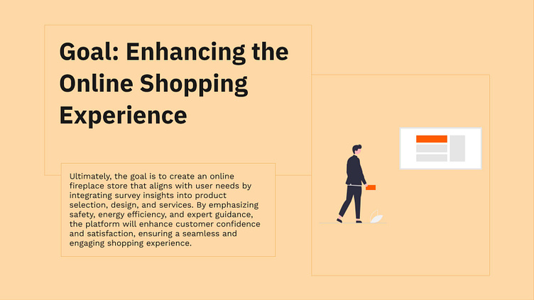
🎯 Goal The goal of Ember Essence is to create a premium online store that prioritizes usability, aesthetics, and conversion-driven design. By leveraging research insights, the platform is crafted to offer clear product comparisons, an intuitive checkout process, mobile-friendly accessibility, and a cohesive brand identity - ultimately making the fireplace shopping experience effortless and enjoyable.
To create a seamless and user-friendly online fireplace store, I conducted a competitive audit of 13 direct and 3 indirect competitors. This research provided valuable insights into industry standards, top UX/UI practices, and unique features that elevate the shopping experience.
In addition to the competitive audit, I conducted a heuristic evaluation to uncover usability challenges and opportunities for improvement. By examining navigation clarity, error prevention, system feedback, and accessibility, I ensured the final design adheres to key UX principles and delivers a superior user experience.
Below, I’m sharing a presentation highlighting the key findings that significantly influenced the development of the Ember Essence online store. By evaluating aspects such as navigation, accessibility, product presentation, checkout flow, and customer engagement strategies, I refined the design to align with user needs and market expectations.


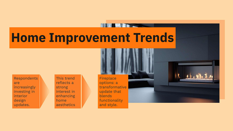
To further understand user preferences, I conducted an online survey that revealed key insights into fireplace shopping priorities. Users emphasized the importance of safety features, energy efficiency, and creating a cozy ambiance. When it comes to design and functionality, modern aesthetics, easy installation, and expert consultations were highly valued. Additionally, special discounts and promotions were found to be significant influencers in the decision-making process, underlining the need for a customer-centric approach in the store design.
I’ve attached the slides below with all the detailed findings that helped shape the design of Ember Essence.


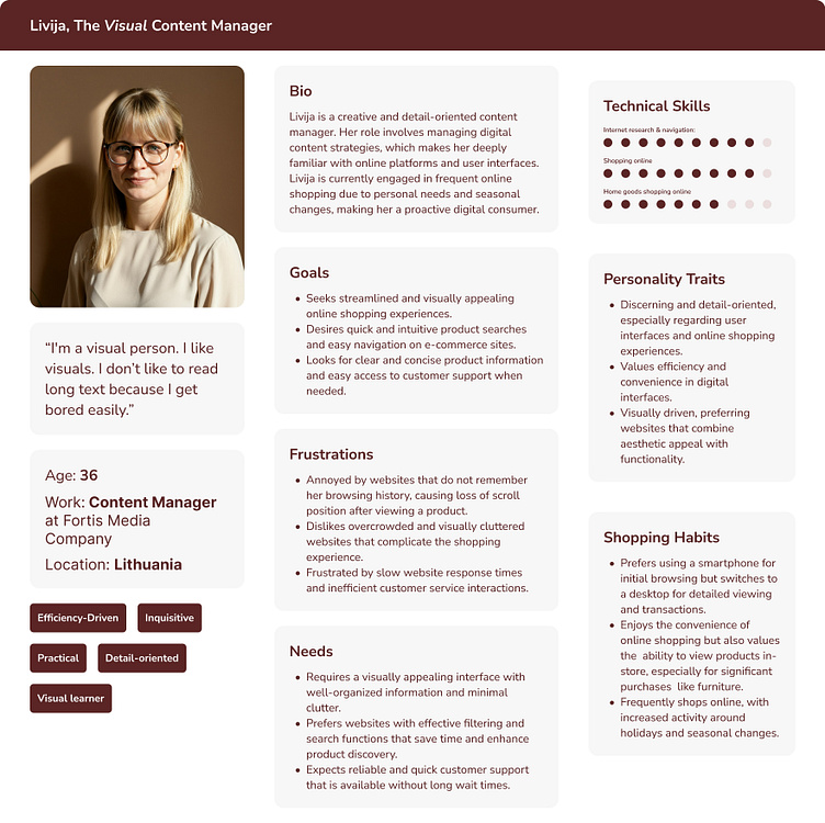
I conducted in-depth interviews and usability tests on competitor websites to gain a deeper understanding of user behavior and pain points. The insights from these tests were organized through affinity mapping, allowing me to identify key themes and prioritize areas for improvement. This process provided valuable information that directly influenced the design decisions for Ember Essence.


Empathy Map:
By creating the empathy map, I’ve gained a deeper understanding of the user’s thoughts, feelings, and behaviors. This exercise allows me to step into their shoes and better understand their needs. By focusing on what users say, think, do, and feel, I’m able to design in a way that truly aligns with their experiences and pain points, ensuring the solution is both useful and meaningful to

After conducting a thorough research process, including competitor analysis, user surveys, in-depth interviews, and heuristic evaluations, I systematically organized all the findings and insights to inform the design decisions. With a clear understanding of user needs and business goals, I moved on to the wireframing phase. This allowed me to structure the layout and functionality of the website, focusing on user-centric design and creating an intuitive, seamless experience for the final product.

After receiving feedback on the low-fidelity wireframes for the homepage, product page, and checkout, I made several key adjustments to improve usability and overall flow. The homepage layout was refined for better content hierarchy, the product page structure was optimized to highlight key information more effectively, and the checkout process was streamlined to reduce friction. To enhance the design, I browsed competitor websites and leading e-commerce platforms for inspiration, ensuring the wireframes aligned with best practices. More detailed and specific refinements were implemented in the medium-fidelity prototype, addressing additional comments and fine-tuning interactions for a smoother user experience.

