Revamping the User Experience: Before & After
Excited to share a UI/UX redesign. The first image showcases the original screens provided by the founder, while the next image presents the refined, modernized version I crafted.

Challenges in the Original Design:
🔹 Cluttered UI affecting usability
🔹 Inconsistent spacing & alignment
🔹 Lack of clear visual hierarchy
🔹 Outdated typography & color scheme
Redesign Goals & Enhancements:
✅ Improved Readability – Optimized typography and spacing for better legibility.
✅ Visual Hierarchy – Organized content structure, making navigation seamless.
✅ Modern Aesthetic – Fresh color palette and refined UI elements for a sleek look.
✅ Enhanced Usability – Intuitive design choices to improve user interactions.
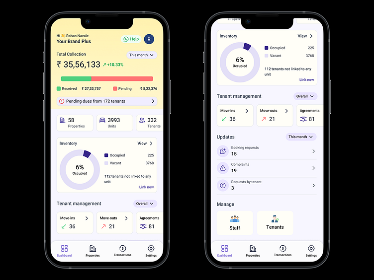
Enter your text here...This transformation not only enhances the user experience but also aligns the interface with modern design standards. Let me know what you think! 👇
