Quick UX Improvements: 10-Minute Design Review
Quick UX Improvements based on a 10-minute design review
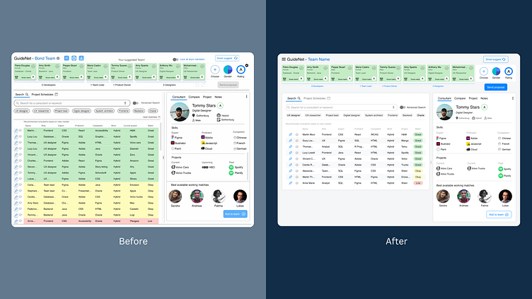
Feedback highlights:
colours take too much visual space
no clear visual hierarchy or separation of sections
crowded feeling
inconsistencies in spacing and typography
Changes:
reduce colour areas and add a chip for labeling
separate areas by using panels
hide non-crucial information
fix inconsistencies in spacing and typography
:)
