Madsen™ - Geometric Roket Logo for a Fintech Banking Company
Case Study: Madsen™ Logo & Branding
The Challenge
Madsen™, a fintech app, needed a modern logo to reflect speed, growth, and trust. Their old branding felt outdated and didn’t connect with their audience.
The Concept
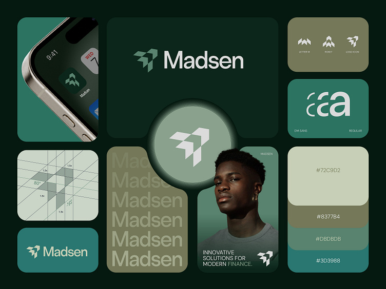
We merged the letter “M” with a rocket to symbolize speed, ambition, and financial growth. The design was clean, dynamic, and memorable.
The Design Process
1. Research: We studied their values and competitors to create a modern yet timeless logo.
2. Sketching: Explored ways to blend the “M” and rocket seamlessly.
3. Colors: Chose green for trust and growth, with olive for sophistication.
4. Refinement: Fine-tuned the logo for versatility across platforms.
The Result
A sleek “M” with a rocket tail, using green and olive tones. Simple, bold, and impactful.
Impact on Business
- Recognition: The logo stood out, making the brand instantly memorable.
- Trust: The professional design boosted credibility, attracting more users.
- Client Feedback: Madsen™ loved it. “It’s simple, modern, and perfectly us,” they said.
Conclusion
The new logo not only refreshed Madsen™’s identity but also helped them connect better with their audience. A small design change with big results. 🚀
Press "L" to show your love ❤️️
______________________________________________________________________________________________
👉 Say goodbye to ineffective logos and hello to a design that’s both memorable and recognizable!🌟
📩 Available for new projects :
Email: [email protected]
WhatsApp: https://wa.me/8801705553455
Telegram: @rahiddesigner
💡 Follow for more update: Dribbble, Behance, Instagram, Twitter, Linkedin
© Rahid Rehman