[PACKAGING DESIGN] PHO HAI THIEN
Hai Thien Pho Spices - Real Pho!
___
Packaging | Branding | Brand Identity
Field: Food
____
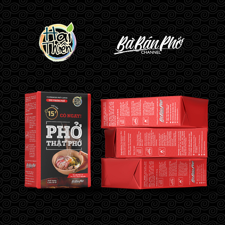
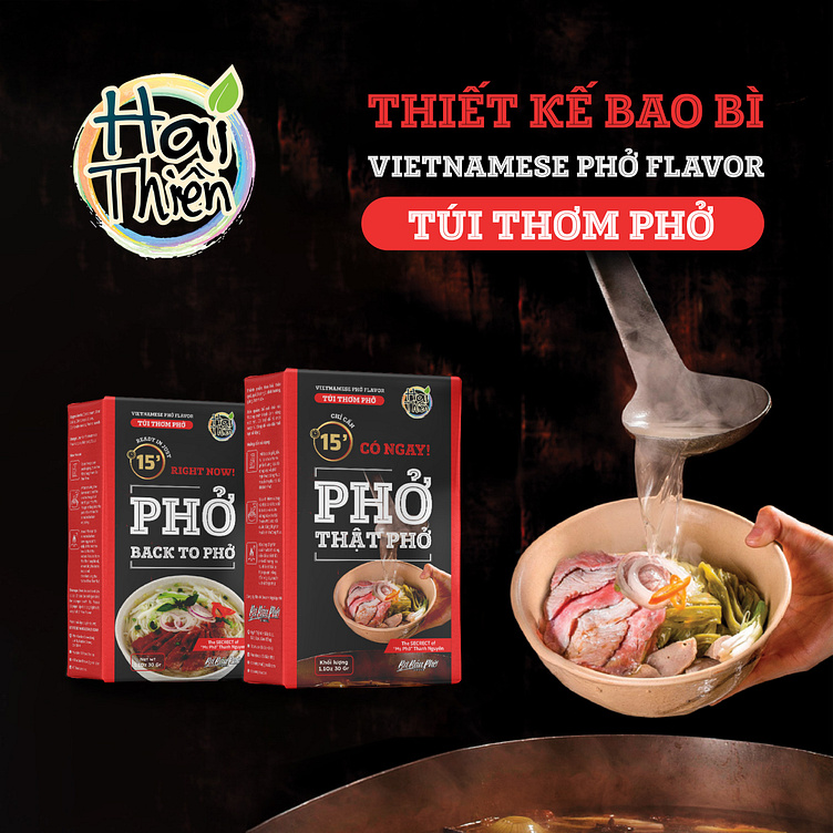
With a love for Pho and a passion for the soul of the dish, Hai Thien (also known as Mrs. Pho) decided to invest in building a brand and strongly developing the product "Pho Fragrance Bag".
The brand always emphasizes the desire for a design that both recreates a professional feeling and evokes a "delicious" feeling.
Faced with that requirement, we decided to use red and black as the main color tones. Because these are two tones that can do a good job of recreating a high-class and professional feeling.
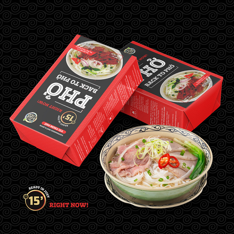
Next, to evoke the feeling of hot, delicious bowls of pho with traditional flavors, we directly used the image of a bowl of pho with steam rising as if it had just been distilled from a pot of rich broth.
The slogan “Pho is real Pho” is placed in the middle to affirm the product’s reputation as well as the brand’s dedication to core quality. Finally, information about net weight, instructions for use and brand logo… are harmoniously arranged on the main and side panels of the packaging.
Designed by Kaiza
Copyright © Kaiza. All Right Reserved
Contact us:
KAIZA CO.,LTD
• P: 0889 996 399
• E: [email protected]
• W: www.kaiza.vn
Connect me @ Behance - Instagram - Pinterest