MDD Brand and ReadyMag Web Design
The Journey Continues...
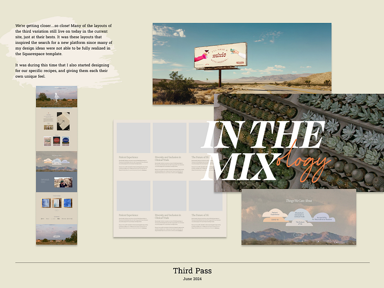
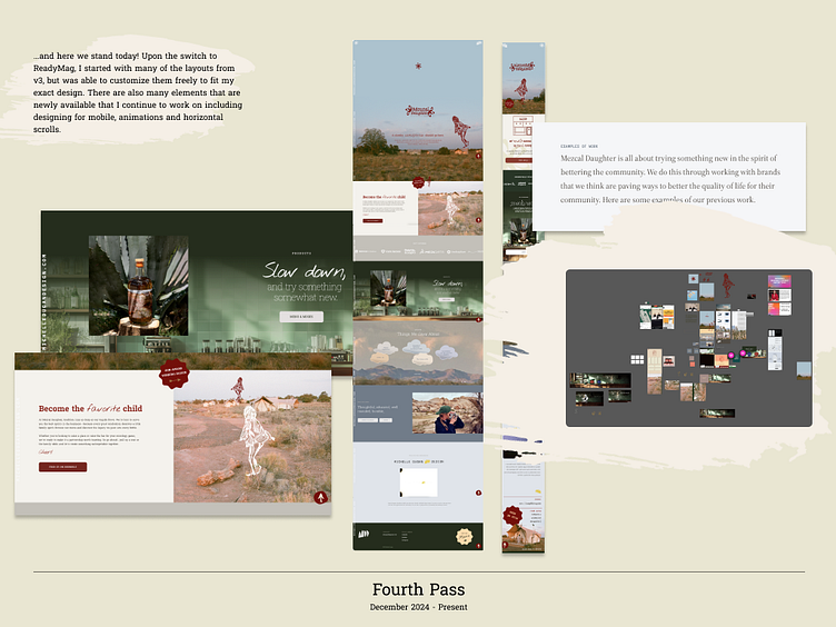
In the fourth installment of the Mezcal Daughter rebrand journey.... we've made it to ReadyMag!
The decision to part from Squarespace did not come easy, but was necessary. The previous platform was a great launch pad, but did not provide the flexibility and freedom our designs so craved. The ReadyMag site allows for animation of our illustrative motifs, unique desktop and mobile variations where necessary (check out that nice horizontal scroll on our desktop menu page), and the freedom to go beyond a template and craft our story the exact way we want to tell it! In celebration of launching the new site, I thought it would be fun to take a look back at the journey, our process, and where we've landed as a brand.
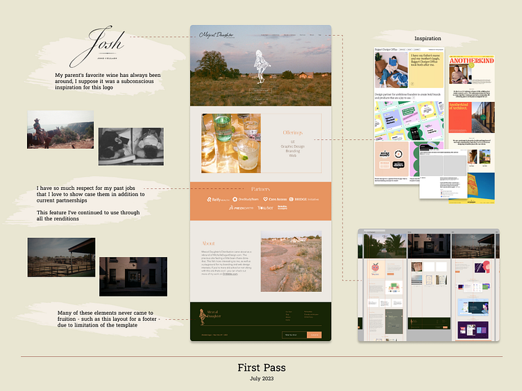
For those of you that are new here, Mezcal Daughter Distributors is not a real brand. Sorry. And I should probably stop saying "we" as the team is just me, Michelle Dugan. Fooled ya. I launched Mezcal Daughter Distributors in July 2023 after deciding I needed to brand myself. In my day job I work to sharpen and beautify brands, making them their most cohesive selves, but taking a look at my own portfolio website, I realized it lacked all of the principles I preach! My portfolio website needed one clear direction that felt authentic to me. So logically I created a fake company name that matched my domain initials - MDD - and the rest is recorded below...
Arizona
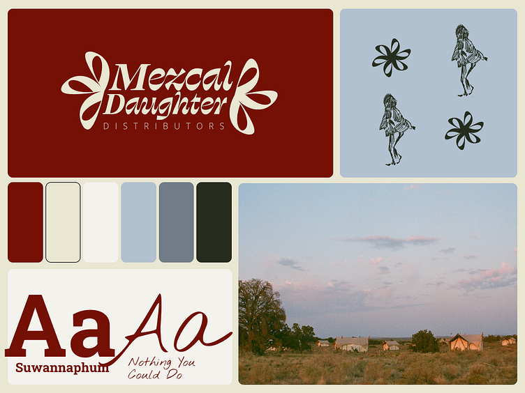
The aesthetic of MDD may seem quite random for a girl from New Jersey. I had just returned back from my first trip to Arizona and fell in love with the colors, the landscape, the nature. On the trip, my sister and I drove around the state - from Phoenix, to the Grand Canyon, Sedona and beyond - camping, hiking, and yes enjoying a prickly pear mezcal margarita every night, and I snapped away on my film camera. All of the pictures you see on the site are from that roadtrip, and my many trips back since. From the photography is also where I heavily drew inspiration for the color palette - reds, greens, blues, hues natural to the region.
Typography
I needed the typography for MDD to feel just right to the brand, but also be web appropriate and accessible. I needed something that seemed western, but modern, and organic but legible. To achieve an old western feeling, I selected the slab serif typeface 'Suwannaphum', which also came with many weights allowing me to use for both Headings and body copy. For fun decorative call outs I used the decorative font 'Nothing You Could Do', which reminded me of hand written notes in a travelers journal - another nod to the first Arizona roadtrip.
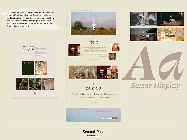
Evolution
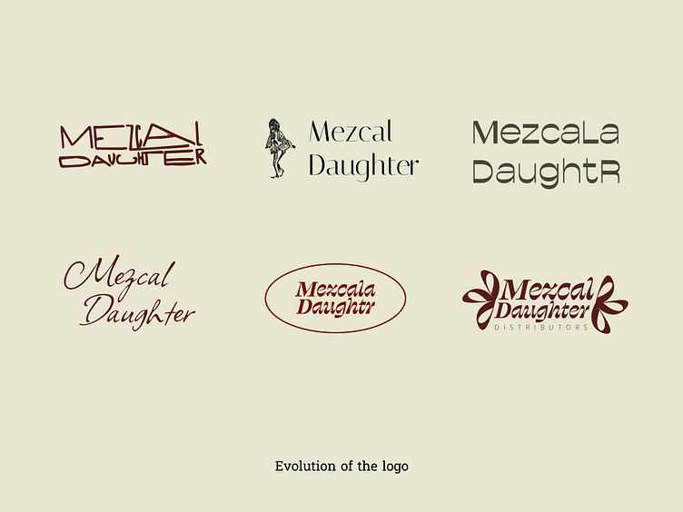
Since inception, MDD has gone through a few facelifts, before landing on the branding you see today. Check out how far we've come below...
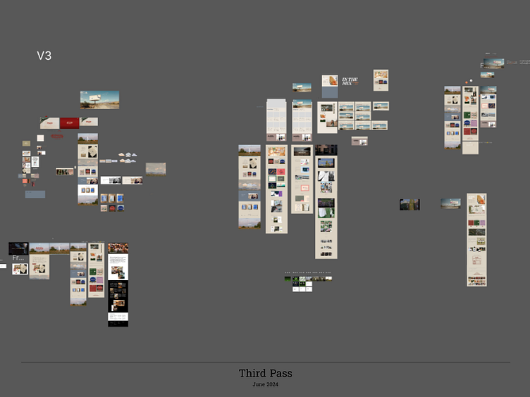
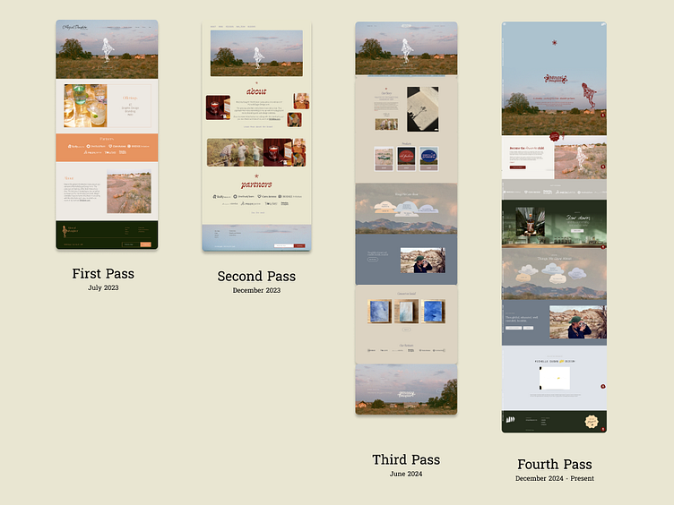
I made the decision to switch web platforms from Square Space to Readymag due to the latters flexibility and freedom to design as if I were in Figma still. As you can see in the videos below, there are many similar layouts between sites 3 and 4. I felt I couldn't bring my designs to the finish line in V3, but am happy with the way they have come out in V4 :)
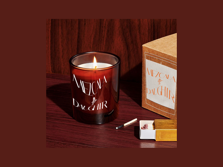
Product Design
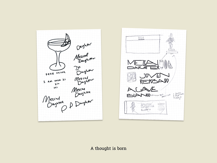
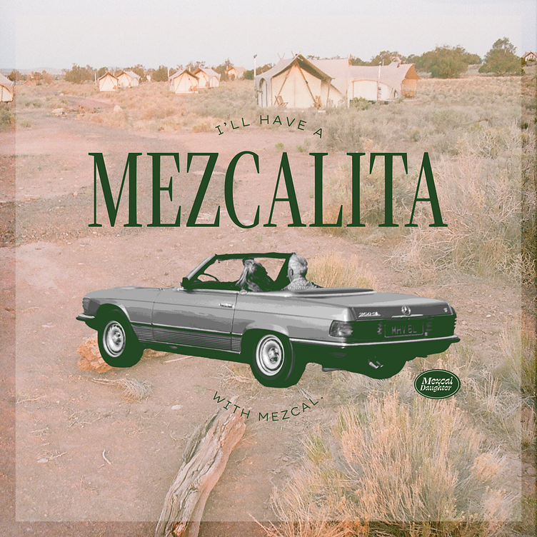
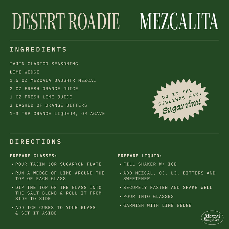
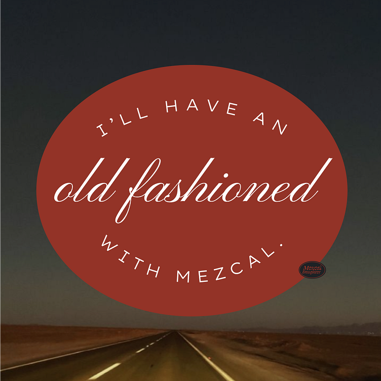
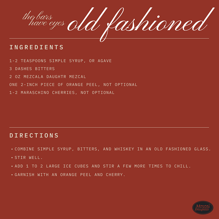
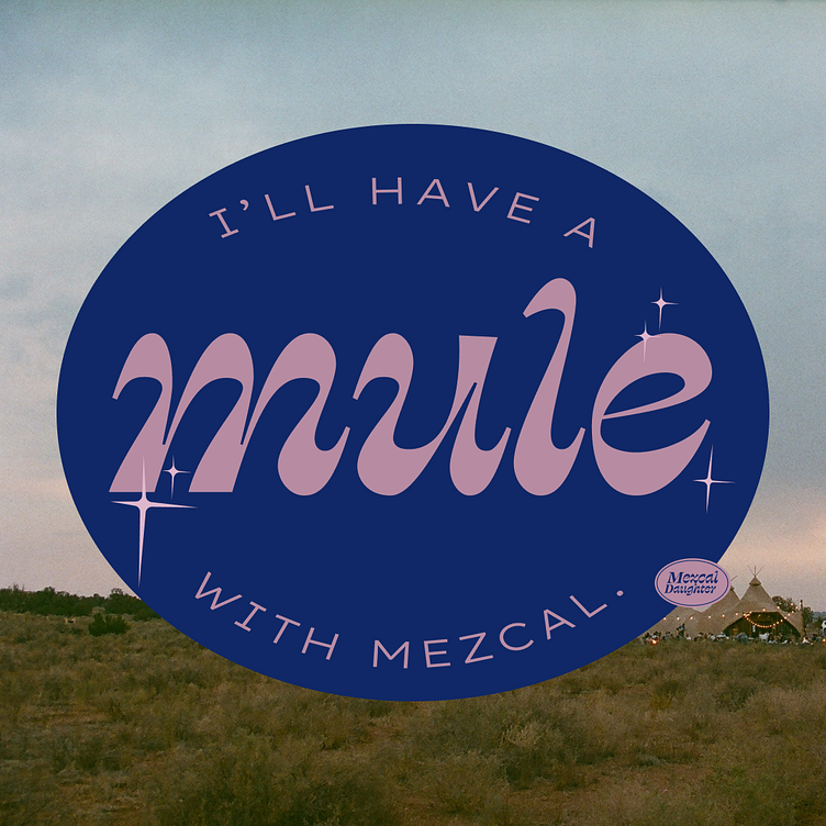
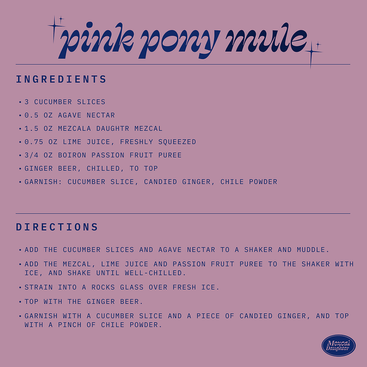
A fake company needs fake products right? I created three top shelf cocktail mixtures; Our Flagship Mezcalita, The Bars Have Eyes Old Fashioned and the glamorous Pink Pony Mule
Today
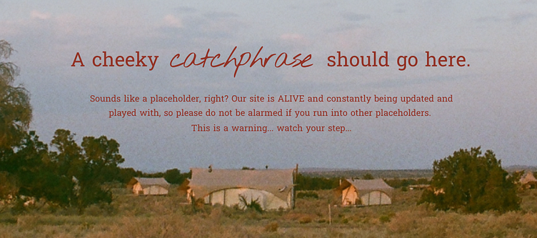
A part of me would love to say "Finished!", but I know that I will have a difficult time stepping away from this ever evolving project. In painting, it is always a fear to over-do a painting, and not step away when you should. So for now, I will try to respect these laws, but know that as I evolve as a designer, so too should Mezcal Daughter. I've left this silly little warning on my homepage so that visitors may be aware when the site becomes a construction zone again.