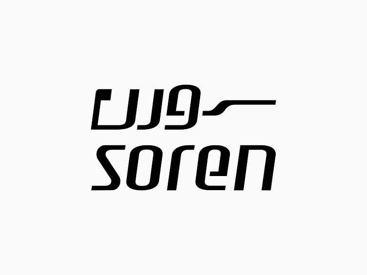
Soren Logo & Stationery Redesign / 2025
Soren Logo & Stationery Redesign / 2025
This project involved the redesign of the logo and visual identity for a technology company in Iran. The nature of this redesign reminded me of my previous experience with the Iran Server logo redesign project, given the similar industry and scope.
About Soren
Established in 2021, Soren Network Group is one of the leading IT companies in Mashhad with over a decade of experience in IT, communications, and cybersecurity services. The company offers a wide range of solutions in networking, security, VoIP, and data centers. Its mission is to enhance communication infrastructure for organizations and startups.
Key Services
Integrated communication solutions, such as Cisco Unified Communication systems
Network security with advanced firewalls
Imagicle software services, including call analytics, digital fax, and interactive voice response (IVR)
A Story of Transformation and Empowerment Through Design
The Soren logo redesign was a challenging yet rewarding journey aimed at encapsulating the core values of a robust IT brand. The goal was to create a logo that not only reflected the company’s identity but also instilled trust and security in its audience.
Key Challenge
The previous Soren logo had significant technical flaws in the coordination between its icon and logotype. These issues necessitated a comprehensive redesign rather than minor adjustments.
Design Process
The project began with consultations and an in-depth analysis of the brand's identity.
1. Creating a Powerful Icon
Designed the letter S as a symbol of connectivity, networking, and information exchange
Emphasized a minimalist, clear, and modern style
2. Bilingual Typography
Crafted both Persian and English logotypes to communicate with domestic and international audiences
Achieved maximum harmony between the Persian and English versions
3. Brand Color Palette
Utilized Cyan Blue as the primary logo color to convey a sense of security, trust, and technology
Complementary colors: white and gray for additional harmony in the visual identity
4. Visual Identity Elements
Designed corporate stationery
Developed a brand guidelines booklet
Competitors and Competitive Edge
Soren competes with leading local brands like Sourena, Novin VoIP, and Pars Ertebat. What sets Soren apart is its stability, exceptional security, and resilience even in challenging situations like power outages or natural disasters.
Design Strategy: A Blend of the "Hero" and "Ruler" Archetypes
Soren's brand identity embodies the strength of the Hero and the authority of the Ruler. The new logo had to express power, trust, and the ability to overcome challenges.
Key considerations included:
- Leveraging the S symbol as the centerpiece
- Adopting a minimalist style while avoiding clichés
- Highlighting Cyan Blue to maintain brand coherence
- Ensuring bilingual representation with Persian and English logotypes
Looking for a logo that captures your brand’s values at first glance?
Feel free to get in touch for consultations and collaborations!


