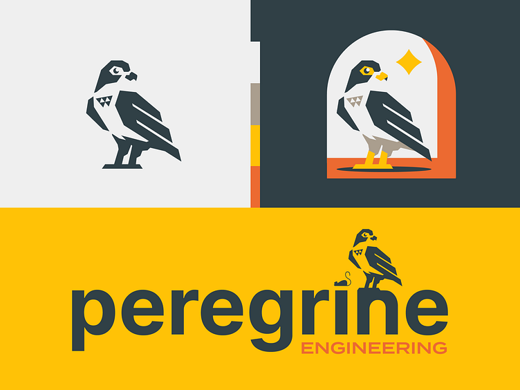
Peregrine Engineering®
Y’all, let's gooooooo! Time for another shot. Love exploring animals in branding especially when the company is named after the animal lol! This logo is all about capturing the precision, speed, and strength of the peregrine falcon!
The falcon’s got a bold, geometric vibe that feels modern but still approachable, with a little triangle detail on its chest that gives a nod to sharp thinking and innovation. For the colors — a sharp dark teal, bright golden yellow, and a pop of orange to keep things fresh and full of energy. And that type — Clean and solid, just like the engineering work this brand represents. Whether you see it as a standalone icon or with the full "Peregrine Engineering" wordmark, it’s built to look good everywhere.
Hope y’all love it as much as I do—let me know what you think!
