Crypto App Design
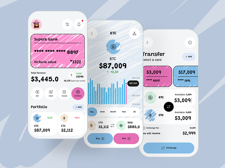
Here, we explored a mobile finance concept that melds classic banking features (like cards and invoices) with crypto portfolio management. Inspired by hand-drawn textures and pastel hues, the design adds a light, friendly feel to financial operations that can otherwise seem intimidating.
1. Visual Flair & Approachability
• Bold, sketch-like backgrounds soften the overall UI, capturing attention and reducing the “corporate” vibe.
• Pastel color blocks highlight key elements—account balances, charts, and transaction actions—while keeping the layout clean and legible.
2. Streamlined Financial Actions
• Familiar workflows (Get, Send, Invoice) are front and center, guiding users through typical everyday transactions.
• An intuitive “Transfer” screen allows quick switching between fiat accounts and crypto assets, ensuring minimal friction.
3. Portfolio Snapshot
• At-a-glance charts and growth indicators show the user’s current standing in both fiat and crypto, empowering them to track performance without diving into detailed analytics screens.
• Color-coded assets (BTC, ETH, etc.) reduce confusion and let users instantly see which currencies are trending up or down.
4. A Friendly, Empowering Aesthetic
• Quirky illustrations and textural elements blend a sense of fun with the reliability of modern fintech.
• Simple iconography complements playful backgrounds, ensuring clarity remains top priority.
By pairing a welcoming visual style with essential banking and crypto features, this concept aims to make personal finance feel more creative, engaging, and easy to manage for both first-timers and seasoned users alike.
Do you want to create something great? Feel free to contact us - 📩 [email protected]
Our Website - https://tino.design/
