Pursuing Real Value For Your Every Move - JACKSON-STOPS
Context
A leading national firm of estate agents with 46 offices across the UK, Jackson-Stops has been growing its reach, advising and supporting on property trading since 1910.
Ambition
Originally added alongside the founder’s name to build a family spirit within the company, it had become clear that the “& Staff” was not being understood by customers. Customer survey feedback showed that many clients were already just using ‘Jackson-Stops’ and it was time to make the change formally.
With this came the potential to refresh the brand as a whole and faced with a rapidly growing digital real estate market and the fresh challenges that brings it was important to have a clean, contemporary brand that could stand out in the digital market place, as well as on the high street.
Action
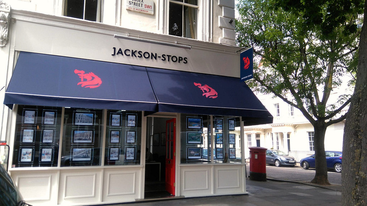
We conducted a thorough audit of digital and brick-and-mortar estate agents, analysing the market and design trends of competing agencies. This let us understand how online trends and property portals are affecting the traditional agency model. We analysed the brand across hundreds of customer touchpoints – from sales boards and stationery to office fronts and advertising.
Result
The iconic Jackson-Stops symbol of a wolf holding an axe in his mouth is not just tied to a company, but originates from the Jackson-Stops family crest. Therefore, it was imperative to treat the mark with utmost respect and care. We carefully crated a mark that not only retains but celebrates this heritage, shaping a new symbol that is as comfortable on a family seal as it is as a digital icon.
