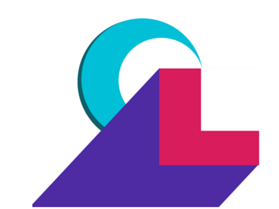
Logo Design for Character Lab
I have been designing a logo for a new project that I am working on - Character Lab. The idea is simple 2 overlapping circles and 2 overlapping squares can create a C and a L. I then added material colours. The C is deliberately behind the L as character is the soft skills and the foundation and the L represents hard skills and the science but with the right Character values supporting the science, the L can rise from being a Learner to a Leader.
What do you think? Am I over thinking this? :)
More by Deborah Kay View profile
Like
