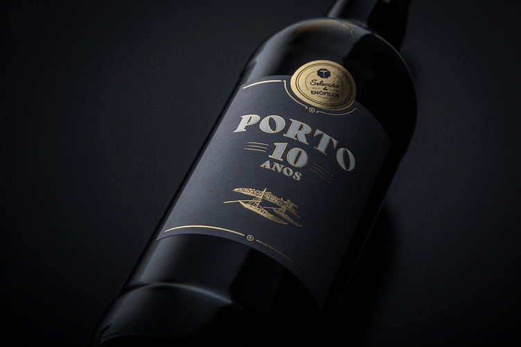
Vinho do Porto, Selecção de Enófilos
The design for the bottles of Vinho do Porto Selecção de Enófilos reflects the essence of the product, smooth, complex, aromatic, and liqueur-like, striking a balance between tradition and modernity, aimed at connoisseurs of unique and distinct experiences.A central design feature is the illustration of rabelo boats, iconic vessels once used to transport wine barrels along the Douro River, crafted exclusively for this product and reinterpreted in a contemporary style, pays homage to the wine’s origins and creates a emotional connection to its history and heritage.The brand’s existing logo was used as a seal, to reinforce the idea of authenticity and quality, referencing the seal of trust typical of premium wines. The golden letters evoke the nobility of the product, while the matte backgrounds in earthy tones and lavender gray recall the landscape of the Douro and the serenity of the riverbanks.The bold detail of the slanted “O” in the chosen font breaks the rigidity of traditional design, giving it a distinct and irreverent visual identity, effective for those who value creativity and innovation.The choice of deep navy blue for the "Porto 10 Anos" product bottle and box conveys sophistication and exclusivity, setting this premium product apart in the market.
Thanks for watching!
Contact us!


