Homeway
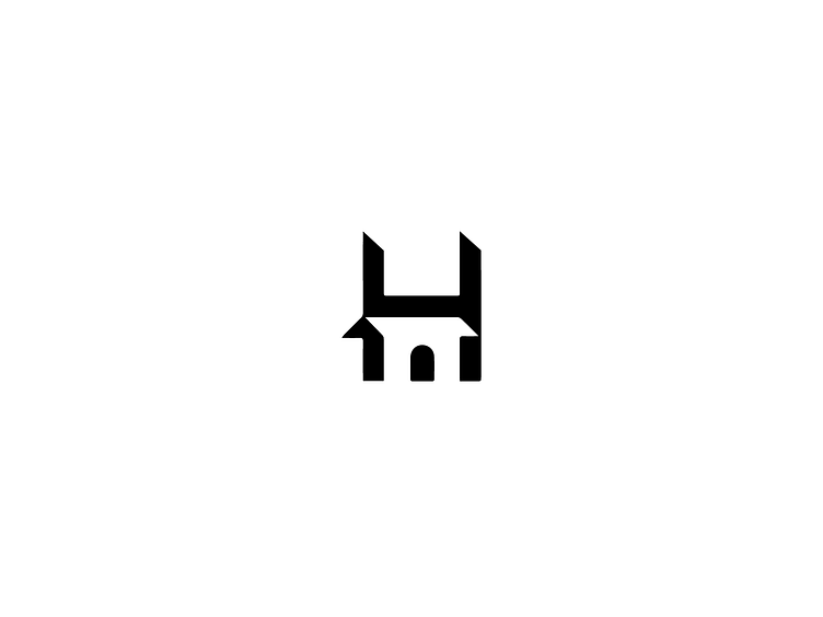
This logo for "Homeway" was designed with simplicity and clarity in mind, capturing the essence of home and connection. The minimalistic approach combines a clean "H" with a house-like silhouette, symbolizing trust, stability, and accessibility.
The angular cut at the base of the "H" mimics a roofline and doorway, subtly integrating the concept of a home without overcomplicating the design. The bold white on a vibrant purple background creates a striking and memorable visual identity, exuding modernity and professionalism. The use of geometric shapes reinforces the brand's focus on structure and reliability, making it versatile for both print and digital applications.
_________________
Thank you for viewing my project!
I truly value connecting with people and understanding their unique creative needs. If you have a project in mind or just want to explore some ideas, I’m here to help. I offer free consultations to chat about how we can bring your vision to life.
Feel free to reach out at ➤ [email protected]
or drop me a message here—I’d love to hear from you!

