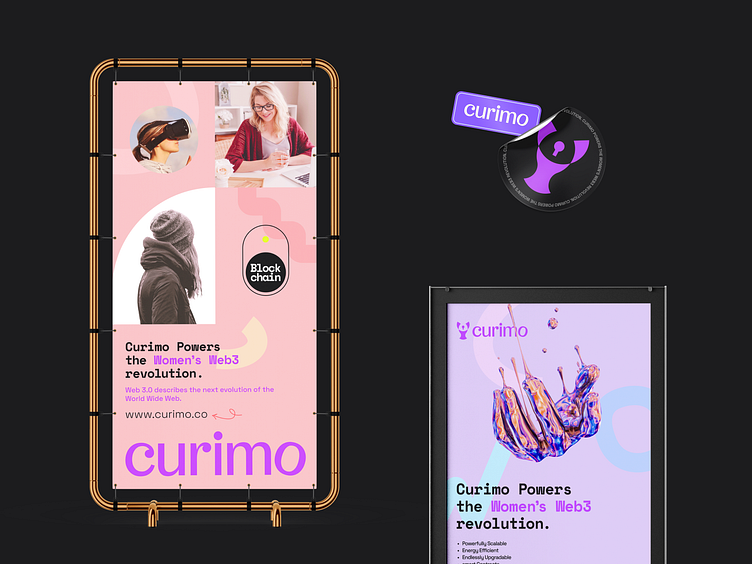
Curimo Brand Identity Design
Curimo is a San Francisco-based web3 company that specialises in offering services meant especially for women, such as blockchain consultation, smart contracts, dApp development, Bitcoin, blockchain wallets, cloud storage, etc. Women feel secure and a part of a welcoming community there. The major objective is to establish a distinct online space where women may develop and support one another.
The logo icon combines a curve that symbolises playfulness, a woman, and a lock. The feminine mood is represented by the bent regular letter used in the logotype. The primary medium orchid colour complements female characteristics. The brand identity as a whole looks relevant because to the soft colour scheme. Curimo's goal is to create a meaningful community of women.
Click here for the whole project.


