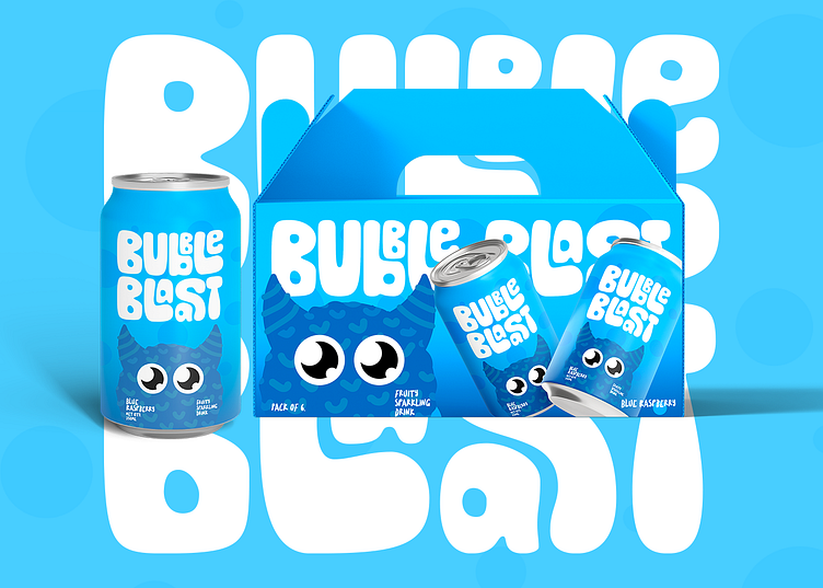
Bubble Blaast - Visual Brand Identity Design (Beverage Brand)
About This Brand
This project was a creative project in creating a fun and engaging sparkling drink brand designed to appeal to kids while resonating with parents. The goal was to combine vibrant visuals, playful characters, and a sense of collectability to make the brand stand out on the shelves.
Concept:
The heart of Bubble Blaast lies in its three adorable monster mascots that bring personality and storytelling to the brand, and each representing a unique flavor:
1. Blue Monster for Blue Raspberry – mischievous and playful.
2. Pink Monster for Watermelon Wave – round and sweet.
3. Green Monster for Green Apple Zing – energetic and like a furry ball.
Logo Design
The wordmark and lettermark for Bubble Blaast comes from a typeface. This specific typeface was chosen because it resembles the thick curvy & bubbly feel in its letters, almost giving the vibe that the wordmark and lettermark are made from bubbles. That, along with the fun and playful vibe of the typeface makes it a perfect match for our brand.
Color Palette
Since the brand offers 3 flavors for its sparkling drinks (blue raspberry, watermelon wave & green apple zing), choosing colors that the kids would absolutely adore, and resembles each flavor being offered by the brand was the best way to go.
Packaging Design - Can
Since it's a sparkling drink brand designed for kids, the best way I figured to grab their attention is to present them with something they love. Cute little monsters! Also, the can design for each flavor was designed with the intention that kids consider these cans as collectibles. With these 2 things in mind, i designed these:
Packaging Design - Outer Box
Below is the packaging design of the can carrier box that can hold up to 6 cans at once.


