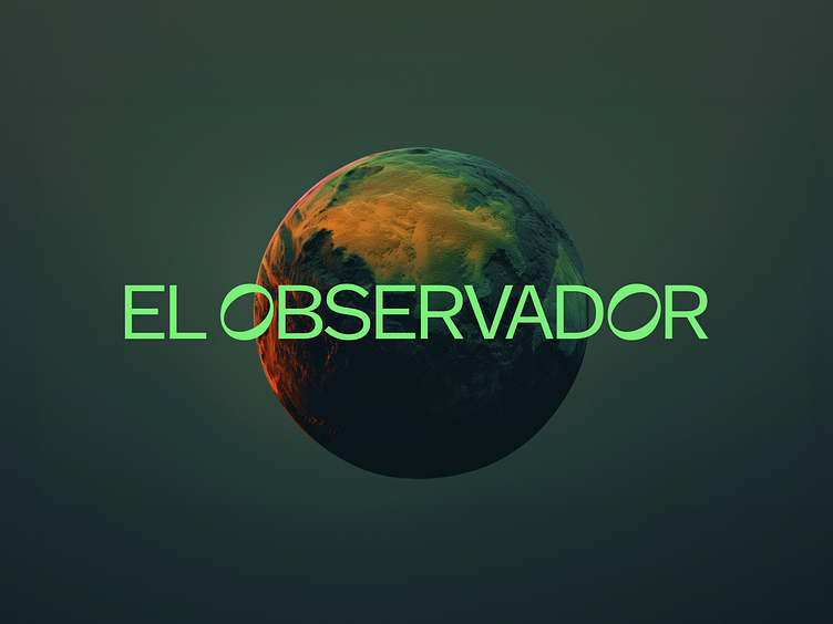
El Observador's New Logo Construction
The new logo honors El Observador’s heritage while meeting modern media needs. We addressed spacing and typographic issues from the previous design, introducing a refined sans-serif typeface that is both fresh and timeless. The iconic “O” has been reimagined as a balanced symbol representing tradition and future ambition.
The sleek “EO” monogram anchors the logo, offering a versatile shorthand for the brand. Its compact, modern design ensures instant recognition across digital platforms and print, seamlessly blending legacy with innovation.
Read the full case study in our website.
Ready to create a brand that makes a difference?
Visit lupastudio.co / Instagram / LinkedIn
More by Lupa studio View profile
Like


