GLOWAY | LOGO DESIGN & BRAND IDENTITY
Every brand starts with a story and the story of Glo Way we share today is about big dreams. From the first steps in the field of communication, Glo Way has continuously expanded, nurturing the aspiration to become a multi-field brand, from healthcare, interior design, education to bigger things.
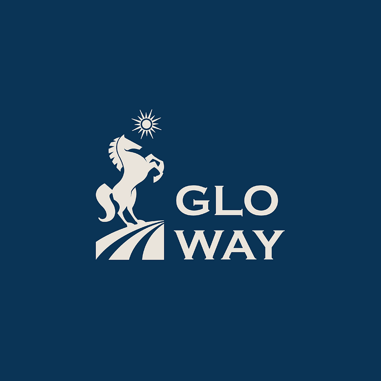
When Glo Way came to Bee Art, we understood that this logo was not only an identification mark but also had to tell a story, conveying the brand's spirit of perseverance and desire to rise. The image of a strong horse, moving forward on a path filled with light (Glow) quickly became the inspiration for the entire design. The horse - a symbol of resilience, strength and constant improvement, is what Glo Way wants to convey.
To match that spirit, Bee Art chose a 2D design style, neat but no less sophisticated. The dominant blue color represents trustworthiness, professionalism and also evokes the image of the vast sky – where Glo Way conquers new limits. Each line is simplified so that the logo can be easily applied to new media and fields that the brand will expand into in the future.
Designed by Bee Art
-
Client Gloway
Logo and Branding Project. Logo is design for Media Company.
Copyright© Bee Art. All Right Reserved
Contact us:
• Hotline/ Zalo: (+84) 77 34567 18
• Email: [email protected]
• Website: www.beeart.vn
• Facebook: https://www.facebook.com/BeeArt.vn


