Weizenbock - Beer Label Design

Beer For Here
Welcome to the "Beer For Here" series. Enjoying a beer is not just about the taste; it's deeply influenced by the surroundings in which you drink it. Inspired by this idea, I've embarked on creating a series of beer labels that encapsulate the essence of various locations and aesthetics—melding the distinctive vibe of each place with the rich history of different beer types. This project aims to transform each sip into a more immersive experience, where the beer and its label are in perfect harmony.
About Weizenbock
Weizenbock: A Bold and Malty Wheat Ale
Weizenbock is a strong, malty German wheat beer that combines the richness of a bock with the spicy, fruity character of a wheat beer. Brewed with a significant portion of wheat malt and a traditional Bavarian yeast, Weizenbock offers complex flavors that include ripe banana, clove, dark fruits like plum and raisin, and caramel or toasty malt sweetness. The beer is typically medium to full-bodied, with a smooth, velvety texture and an ABV ranging from 6.5% to 9.0%.
Weizenbock can be enjoyed in both pale (helles) and dark (dunkles) versions. The pale version is lighter in color and emphasizes fruity and spicy notes, while the dark version features deeper malt flavors like chocolate, toffee, or bread crust.
Cultural and Seasonal Significance Weizenbock is often brewed for colder months, offering a warming quality that makes it perfect for winter or festive occasions. Its complexity and rich flavor profile make it a standout among wheat beers, ideal for sipping and savoring. Paired with roasted meats, stews, or desserts, it’s a versatile and satisfying beer style.
About The Design
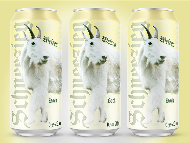
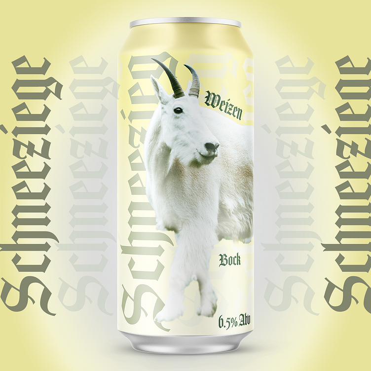
The design for Schneeziege Weizenbock perfectly encapsulates the beer's bold and traditional character while nodding to its Alpine roots. The central imagery features a pristine white mountain goat (or Schneeziege, German for "snow goat"), symbolizing strength, resilience, and a connection to mountainous landscapes where bocks and wheat beers are deeply rooted. The goat, a common icon for bock beers, is depicted in a way that highlights purity and elegance, reflecting the smooth yet complex profile of a Weizenbock.
The soft yellow and white color palette conveys the beer’s balance of wheat-driven lightness and malty warmth. Gothic-style typography lends a nod to the beer’s German heritage, reinforcing its authenticity and traditional craftsmanship. The interplay of bold lettering and clean design creates a striking yet approachable aesthetic, much like the beer itself. Schneeziege ties the design and style together by celebrating the rich cultural and natural elements that inspire this classic Weizenbock.

