ecommerce logo, app logo, logo, logo design
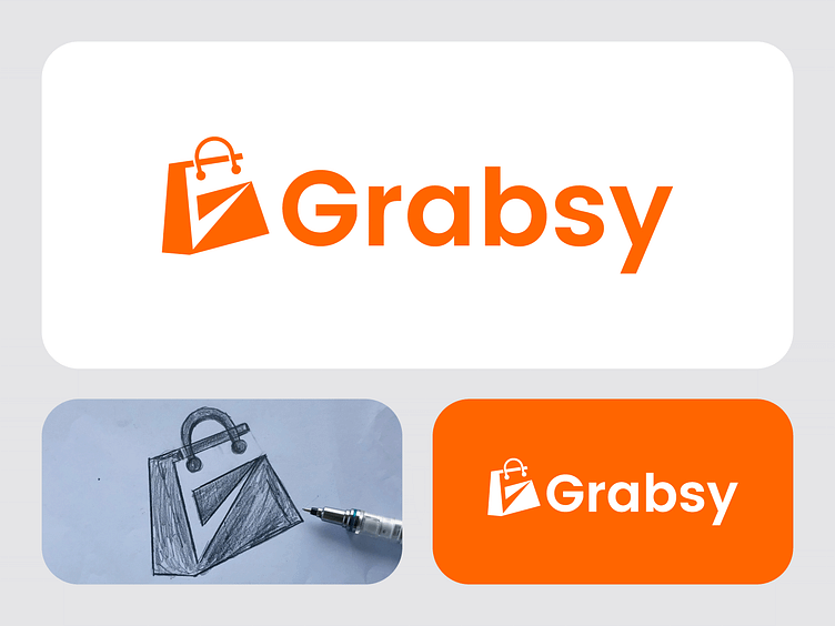
I had the chance to work on a logo design for Grabsy, a brand that’s all about making shopping easier and more enjoyable. My goal was to create something modern, reliable, and smart, while keeping the design clean and memorable.
The process started with over 20 sketches as I explored different ways to bring Grabsy’s identity to life. After refining the ideas, I landed on a concept that combines the letter ‘G’ with a shopping bag—simple, yet it perfectly captures what the brand stands for.
For the final touches, I went with a bright orange color to reflect energy and trust, and paired the design with the Poppins typeface to give it a fresh, professional vibe.
What do you think? I’d love to hear your thoughts!
For all inquiries and consultations, please feel free to reach out:
📧 Email : [email protected]
☎️ WhatsApp: Click here to initiate a conversation 💬
