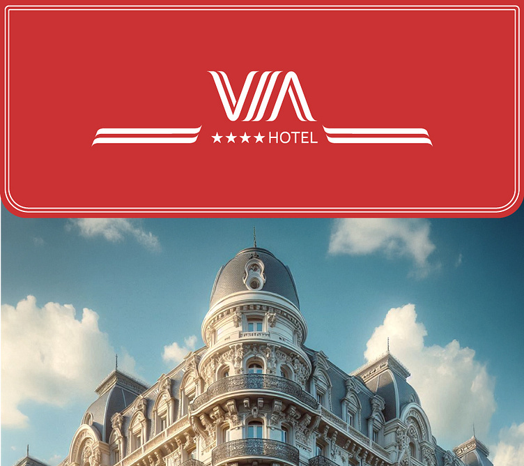
VIA Hotel - Logotype
Hotel VIA is a conceptual project inspired by its name, derived from its location on Viamonte Street. The branding takes cues from the hotel's historical essence while incorporating modernized lines to reflect a contemporary twist.
The design features smooth shapes to evoke a sense of calm and relaxation, complemented by a triangular form that symbolizes direction and movement, guiding guests through an elegant journey.
The color palette is anchored in a refined shade of red, chosen to convey sophistication and elegance. This color is applied with care to maintain a relaxing atmosphere and avoid overly energetic tones.
*This project is a work in progress, and the application of the modal logo will be loaded soon.
First Logo and Variations
Thank you for watching the project!
More by Daniel Wolovelsky View profile
Like


