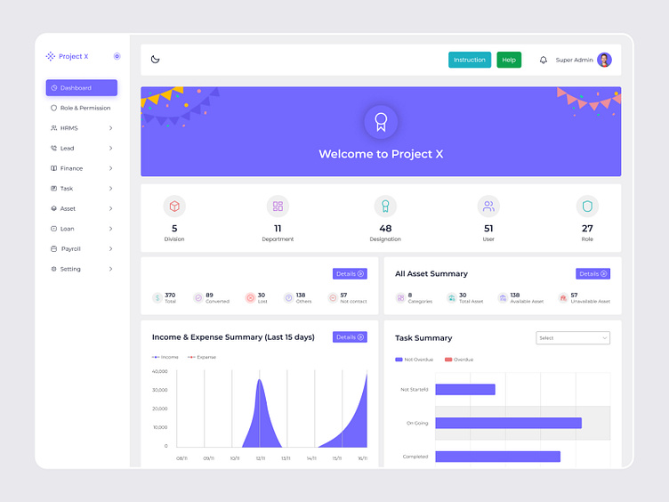
Project X Dashboard Overview 🚀📊
This is the Project X dashboard, designed with a clean and minimalistic light mode interface. 🌞 It features a sidebar navigation menu with sections like HRMS, Finance, Tasks, Assets, and more for effortless navigation. 📂 The top banner offers a cheerful welcome message 🎊, and the dashboard displays key metrics like division and department counts, user roles, and lead status summaries. 💼 Graphs and charts, such as income vs. expense summaries 📊💸 and task progress bars 📈, provide clear insights at a glance. A bold “Open Ticket” button 🎟️ ensures quick access to support. The design emphasizes clarity, functionality, and user engagement. 🌟
See the full case study on Behance
Looking to make your brand iconic?
"Want to know more? Say 'Hi' to my
📞What's App
Let's talk about your project..
➡️ Review our complete design case studies on Behance.
Tap follow for a stream of aesthetic design inspiration.

