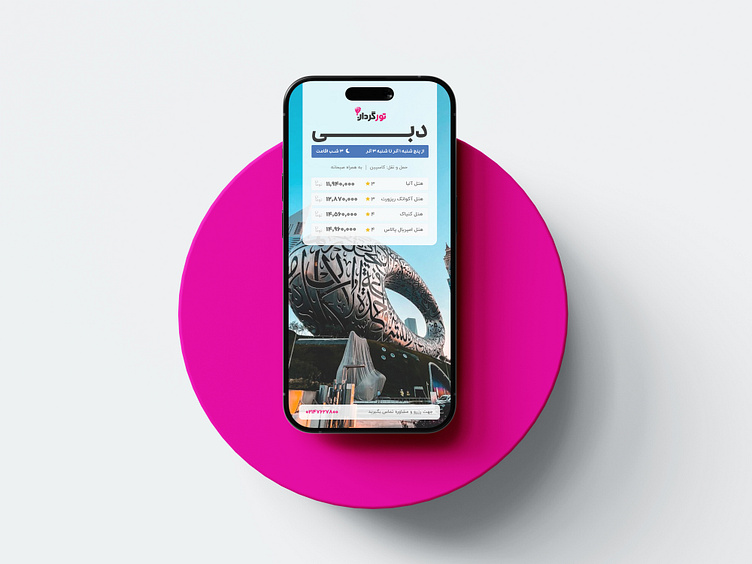
Instagram layout redesign for "Torgardan"
Instagram layout redesign for "Torgardan" / 2024
In the digital world where user experience is the first word, an organization's pages on social platforms such as Instagram must also constantly adapt to the needs of users.
Taeget
The purpose of this project was to redesign the Instagram layout by examining user problems and providing smoother and more pleasant experience
n a world where users are looking for speed and convenience, complex and inconsistent design can be an obstacle to attract users.
The feedback received from users shows that although the old layout of Instagram is understandable for many users, some aspects of the design of this brand need to be improved.
such as:
Excessive use of graphic elements:
Lack of negative space:
Insufficient contrasting colors:
Using mismatched colors:
Oversaturation:
Unprofessional or mismatched fonts:
Inappropriate font size:
Not using visual hierarchy:
.lack of clarity of the main message:
Lack of Call to Action:
Using old or unprofessional clip art:
Visual imbalance:
Irregular arrangement:
Poor alignment:
Neglect of branding:
Result
This project was started with the aim of simplifying and optimizing this design, so that the tour guide can be more adapted to the needs of its users.
This project provided an opportunity to rethink and create a new design that not only solves current problems, but also charts the future direction of Instagram design.
I hope you like it.
Hit "❤️" for Like!
Any feedback is welcome....
💠Need a perfossional logo and identity brand ?
⚡Contact me to order the new project: [email protected]
💢Follow my website : Shirinafshar


