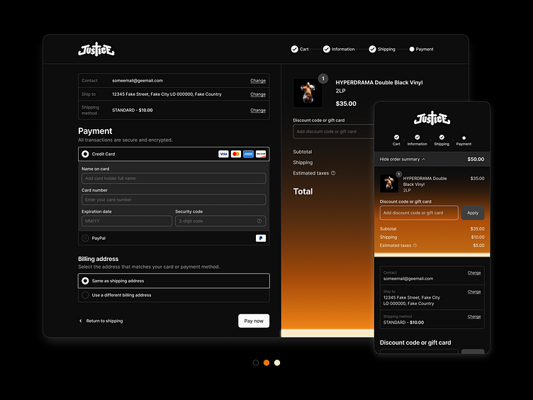
Day 2 - Checkout Page (Daily UI Challenge)
For today’s Daily UI challenge, I created a checkout page inspired by Justice’s latest album, "Hyperdrama". The glowing orange tones from their artworks inspired the branding, giving this design a bold yet refined look.
My Thought Process:
Optimized Usability: A clean, organized layout ensures a smooth checkout experience across desktop and mobile.
Inspired Aesthetic: Warm gradients and minimal design echo the album’s mood while maintaining focus on functionality.
Mobile-First Considerations: Responsive adjustments ensure clarity and usability across devices.
What do you think about the mix of bold branding and usability? 🚀
More by Kelvin Chau View profile
Like


