BUISNESS FLYER
This is the way I designed this modern and professional business flyer:
Design Description for the Business Flyer
Eye-Catching Header:
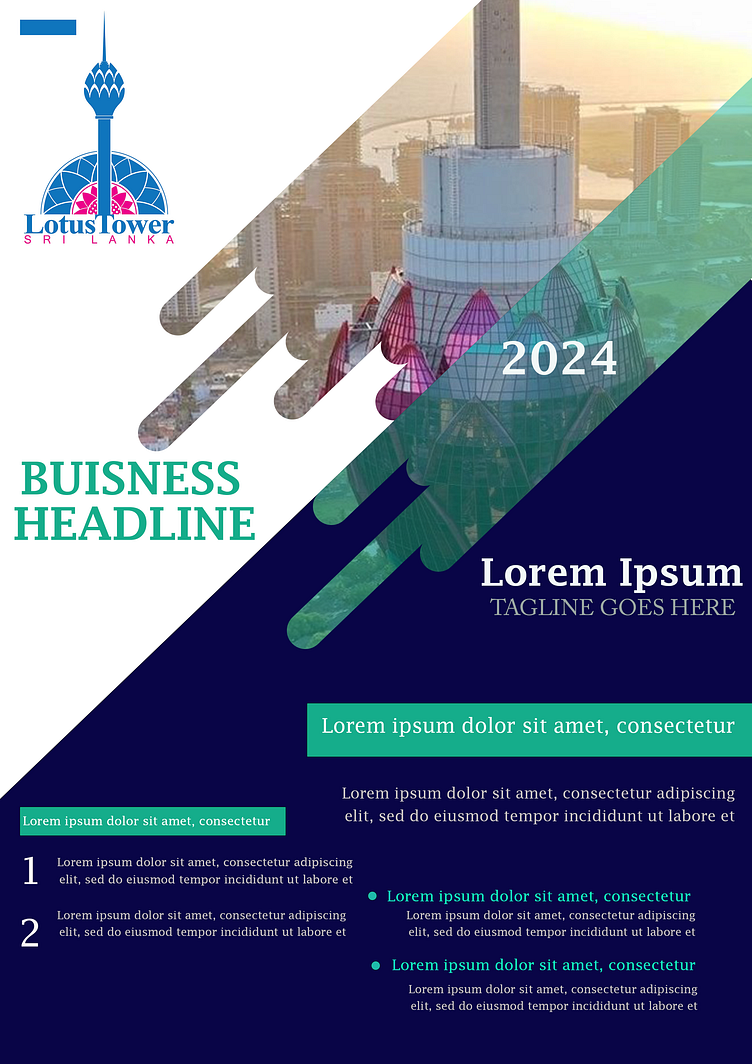
The flyer prominently features the Lotus Tower logo in the upper left, establishing a strong connection to the location and theme.
The year "2024" is subtly overlaid on the image to emphasize a futuristic and timely context for the business or event.
Creative Use of Imagery:
The diagonal placement of the Lotus Tower photo with overlapping transparent layers adds depth and creates a modern, sleek aesthetic.
The layered "cut-out strokes" effect over the image enhances creativity, making the design visually distinct and engaging.
Professional Color Scheme:
The navy blue background conveys professionalism and trust, while green accents highlight key text, ensuring readability and vibrancy.
The white space is used effectively to maintain balance and avoid visual clutter.
Typography:
A bold and modern font is used for the main headings like "Business Headline" and "Lorem Ipsum," making them easy to read and impactful.
Subheadings and body text are clean and legible, maintaining the professional tone of the flyer.
Organized Content:
The bottom section breaks information into numbered points and bullet lists, making details easy to scan and digest for the audience.
The inclusion of placeholder text provides structure for additional detailed information.
Stylish Layering and Diagonals:
Diagonal color blocks create a dynamic layout, dividing sections while guiding the viewer’s eyes naturally from top to bottom.
Overlapping elements (image and text) give the design a sense of motion and energy.
Highlight Boxes:
Green highlight boxes effectively draw attention to important messages, ensuring they stand out from the rest of the content.
Balance and Alignment:
Every element, from the logo to the text, is perfectly aligned for a harmonious and polished look.
Symmetry in the placement of text and graphics adds to the flyer’s overall balance.
This flyer is a perfect blend of creativity and professionalism. Its innovative design elements, combined with a clean and organized layout, make it ideal for promoting events, businesses, or projects in a visually appealing manner.
