R+ARROW LOGO / R LOGO / R MONOGRAM / R+ARROW ICON
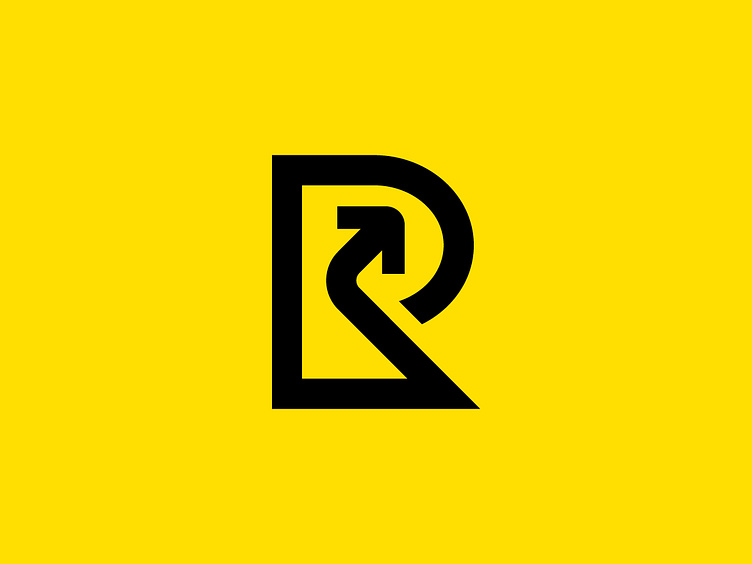
This strong and minimalist "R + Arrow" logo is designed to convey clarity, direction, and progress. The bold integration of the letter "R" with an arrow creates a modern and striking visual that embodies forward-thinking and momentum. Its clean lines and geometric structure enhance its simplicity, ensuring versatility across various mediums, from print to digital.
The arrow seamlessly pointing upward symbolizes growth, ambition, and positive outcomes, making it ideal for brands focused on empowerment, innovation, or guiding their clients toward success. The balanced use of negative space within the design gives it a professional yet approachable feel, while the vibrant yellow background adds energy and optimism, perfectly complementing the bold black logo.
This logo’s timeless design ensures it resonates with a wide audience, making it adaptable for industries like logistics, technology, consulting, or education. It communicates strength and focus in a way that aligns with any brand aiming to inspire confidence and lead with purpose.
