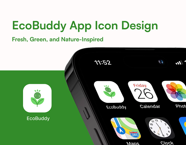
Green and Growth: The EcoBuddy App Icon Design
🔆 Introducing the EcoBuddy App Icon! 🌿
I’m excited to share the new icon design for EcoBuddy, an app dedicated to promoting environmental sustainability. Through its thoughtful elements and color scheme, this icon aims to encapsulate the essence of nature and growth.
🌸 Design Elements:
• Flower and Leaves: Representing growth and sustainability, the green flower with its leaves creates a connection to nature. The three small leaves at the top symbolize continuous effort and progress.
• Colors: Utilizing shades of dark and light green to convey life, freshness, and a calm, trustworthy feel. Subtle shadows and highlights add depth and make the icon stand out.
• White Background: Chosen to create contrast and highlight the icon, the white background offers a clean and minimalist look.
🎨 Why This Design?
The goal was to beautifully represent EcoBuddy’s environmental mission. The nature-inspired elements and green hues emphasize life and growth, aiming to attract users and foster an emotional connection with the app’s objectives.
Check out the design and let me know your thoughts!

