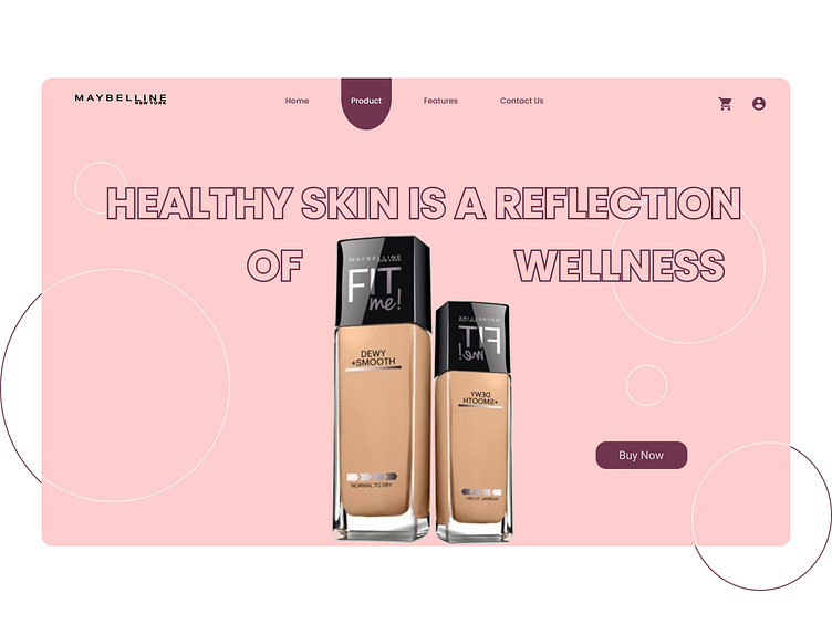
Beauty Reinvented: Maybelline Redesign Concept
Redefining Elegance with a Minimalist Touch ✨
This redesign of the Maybelline landing page celebrates the brand's vibrant personality while embracing a minimalist aesthetic.
Key Features:
Simplified Navigation: Clean and intuitive menus for effortless exploration.
Bold Visuals: High-quality product imagery and dynamic banners to captivate attention.
Optimized Call-to-Actions: Strategically placed buttons with vivid colors to drive conversions.
Typography: The clean and versatile Poppins font is used throughout to ensure readability and modernity.
Color Palette:
Primary: A rich, elegant #71364F for sophistication.
Accent: A soft, lively #FECDCD to add warmth and vibrancy.
Designed in Figma, ensuring precision and adaptability for development.
More by Sanjivani Tharani View profile
Like


