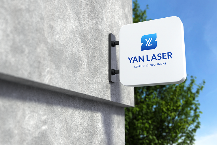
YAN(G) Laser Logo Design
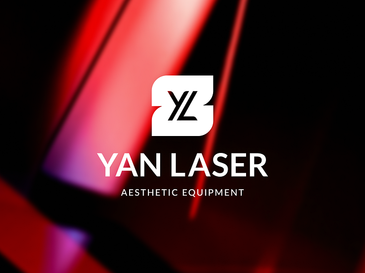
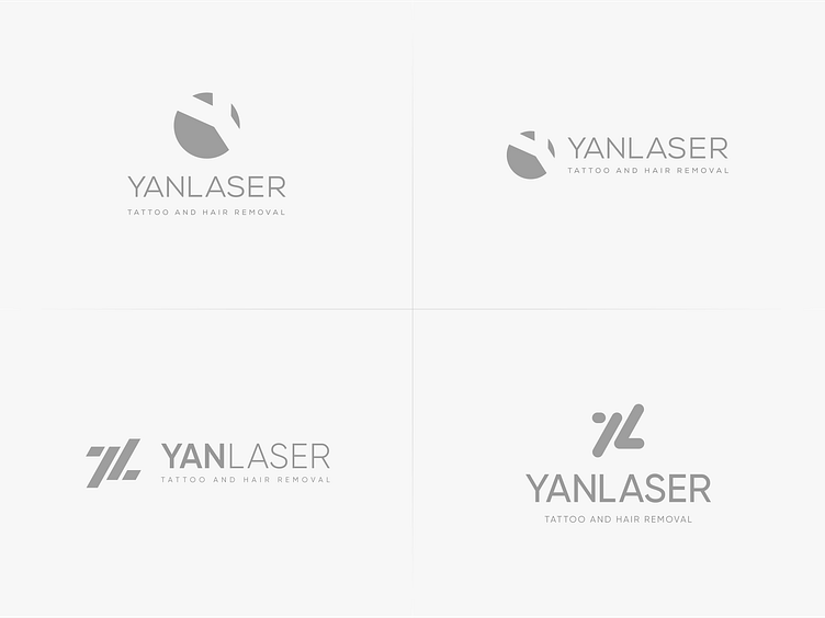
I'm delighted to share another logo from my archives that I designed last year. This is a special logo for me because it was designed for a friend of mine who runs a business of producing and delivering laser medical equipments. He asked me to create a simple logo so he could put it on his devices. I wanted to combine letters "YL" (Yan - name of the owner + Laser) in the group in order to be able to use this composition separately according to his needs.
The previous visual identity did not fully reflect the level of innovation, precision, and reliability that the brand offers. The goal was to create a modern and professional look that would enhance the perception of the company among clinics, medical professionals, and distributors.

Results
The new logo helped YAN Laser present itself as a more serious and trustworthy brand in both local and online markets.
Improved visual consistency across product packaging, printed materials, and digital platforms strengthened the overall brand image.
The updated identity made it easier for the business to communicate its values of precision, quality, and innovation.
As a result, clients and partners began to associate the brand with a higher level of professionalism, which positively influenced their confidence in the product line.