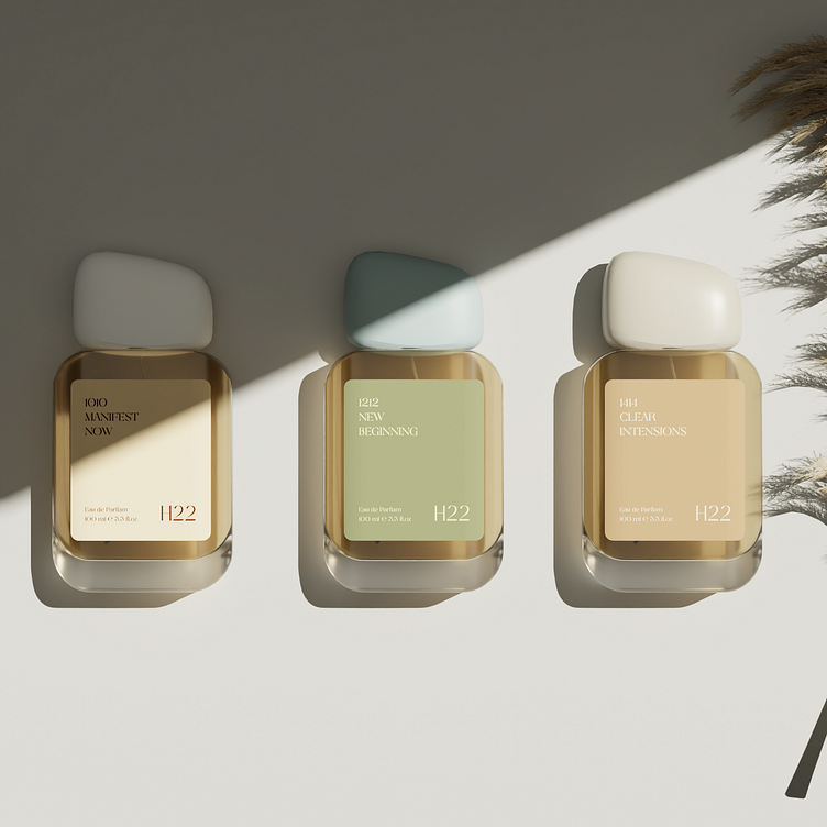
Brand H22 – Perfume Bottle & Label Design
DESIGN BY PIXELAIN
Brand H22 – Perfume Bottle & Label Design
Project Overview:
This perfume design project for H22 was crafted to embody elegance with a minimalistic approach. Our aim was to blend simplicity with high-end aesthetics, creating a visually compelling bottle design and label that aligns with the brand’s refined identity.
Design Approach:
The bottle’s silhouette features sleek lines, enhancing its modern and premium feel. The label complements this design with subtle typography and creative use of white space, achieving a balanced look that’s eye-catching yet understated.
Color & Aesthetic:
A soft, muted color palette was selected to radiate sophistication and luxury. Minimalist color choices allow the bottle’s shape and label to stand out without overwhelming, keeping the focus on H22’s essence.
Result:
The final design successfully captured the brand’s desired luxury image, resonating with H22's target audience and generating positive client feedback. The cohesive look and minimalist aesthetic positioned the product as a sophisticated choice in the perfume market, enhancing brand recognition and appeal.
#PerfumeDesign #MinimalistAesthetic #LuxuryBranding #H22 #ProductPackaging
Don’t forget to appreciate my work if you like the design
Design isn’t just what it looks like; it’s how it speaks. If you’d like to collaborate or have any questions, feel free to reach out to me at
Let’s create something amazing together!


