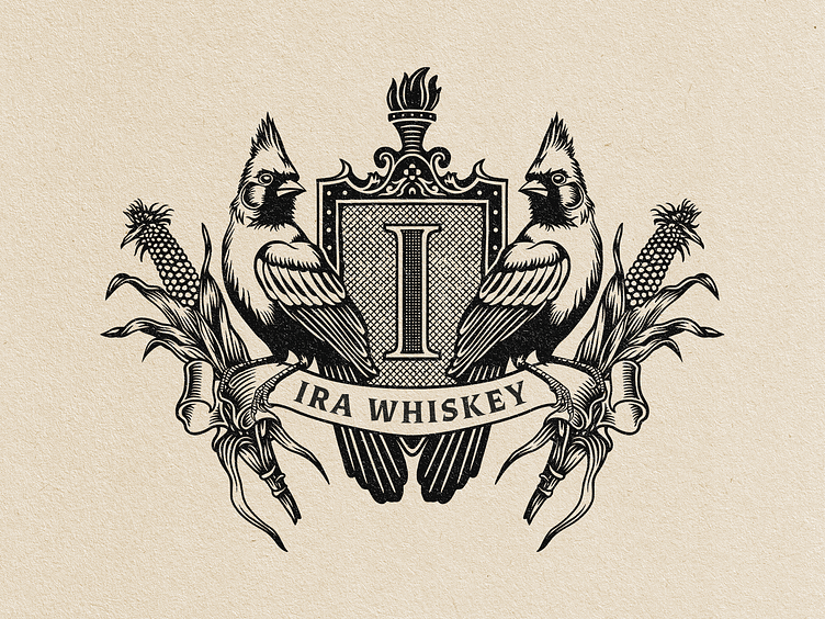
Ira Whiskey Crest Illustration
This illustration is a classic-style logo for a whiskey brand called "Ira Whiskey." It has a vintage, handcrafted feel, like an old family crest. Here’s a simpler breakdown of its parts:
1. Center Shield with "I": At the center, there’s a shield with a large "I" on it, representing the brand name. The shield has a textured, old-fashioned look.
2. Two Cardinals: On each side of the shield, there’s a cardinal bird, facing outward. The cardinals give it a natural, regional feel and add personality to the design.
3. Corn Stalks: Behind each bird, you can see corn stalks, which tie in with whiskey’s roots in agriculture and grains.
4. Banner with the Brand Name: Across the bottom, a ribbon banner says "IRA WHISKEY" in bold, traditional letters.
5. Torch at the Top: Above the shield, there’s a torch, which gives a sense of warmth and tradition.
The whole design has a classic, hand-drawn look in black ink on a beige background, making it feel vintage and timeless - perfect for a whiskey brand that wants to look both traditional and high-quality.
https://www.thegasparcosta.com/
