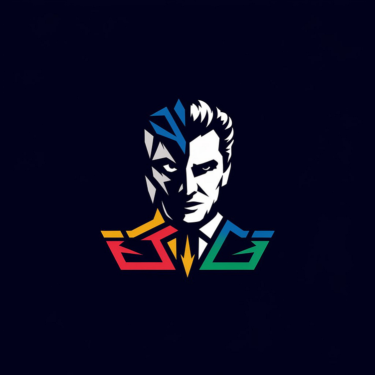
case study logo design
why this logo is great
this logo is a combination of two stuff a balanced one and a beast while make the logo i face something very strange the logo is about a company who wants his brand value directly counter the owner of the company
how i connect owner into logo
this is a good thought but making a company brand value using owner name is not quite good so i have to make something which look like owner but it's not the company is a finance company i use psychology colour's, triangles shape and perfect match with RGBYGB
i made my first final project and send it for feedback the things i said at first combination of beast is not tearing up with it thats why we worked and made the best outcome possible
More by surjeet View profile
Like

