LAMSON - Knives and Kitchen Products
LAMSON - Knives and Kitchen Products
Digital Ink Agency
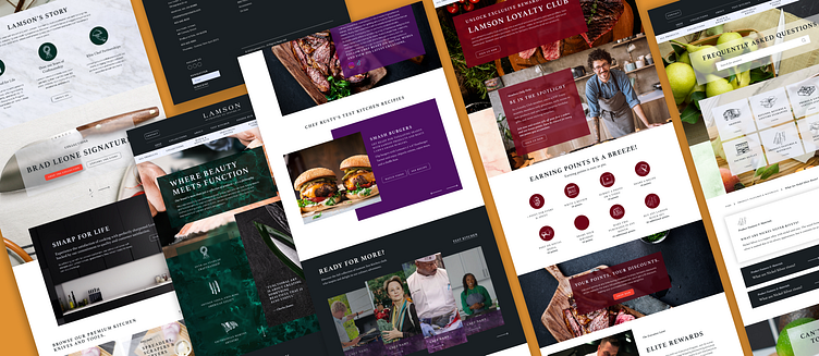
The objective is to design user-friendly e-commerce platforms that effectively showcase the factory's premium culinary offerings, ensuring a seamless and friendly user experience, enticing visuals, and robust functionality. These platforms are crafted to increase brand visibility, engage customers in an interactive and contributive manner, and drive sales within the culinary industry.
Challenge
The primary challenge for Lamson's website was to enhance brand awareness and drive increased sales. The existing online presence was not effectively capturing the target audience's attention, leading to limited brand recognition and, consequently, lower sales figures.
Solution
To overcome challenges, we undertook a complete redesign for Lamson's website, focusing on:
Modern Website Design: Created a visually appealing, contemporary design that reflects Lamson's brand identity and conveys innovation and reliability.
Brand Awareness: Enhanced brand recognition through compelling brand stories, collection narratives, and high-quality imagery that emphasize Lamson's history, values, and dedication to excellence.
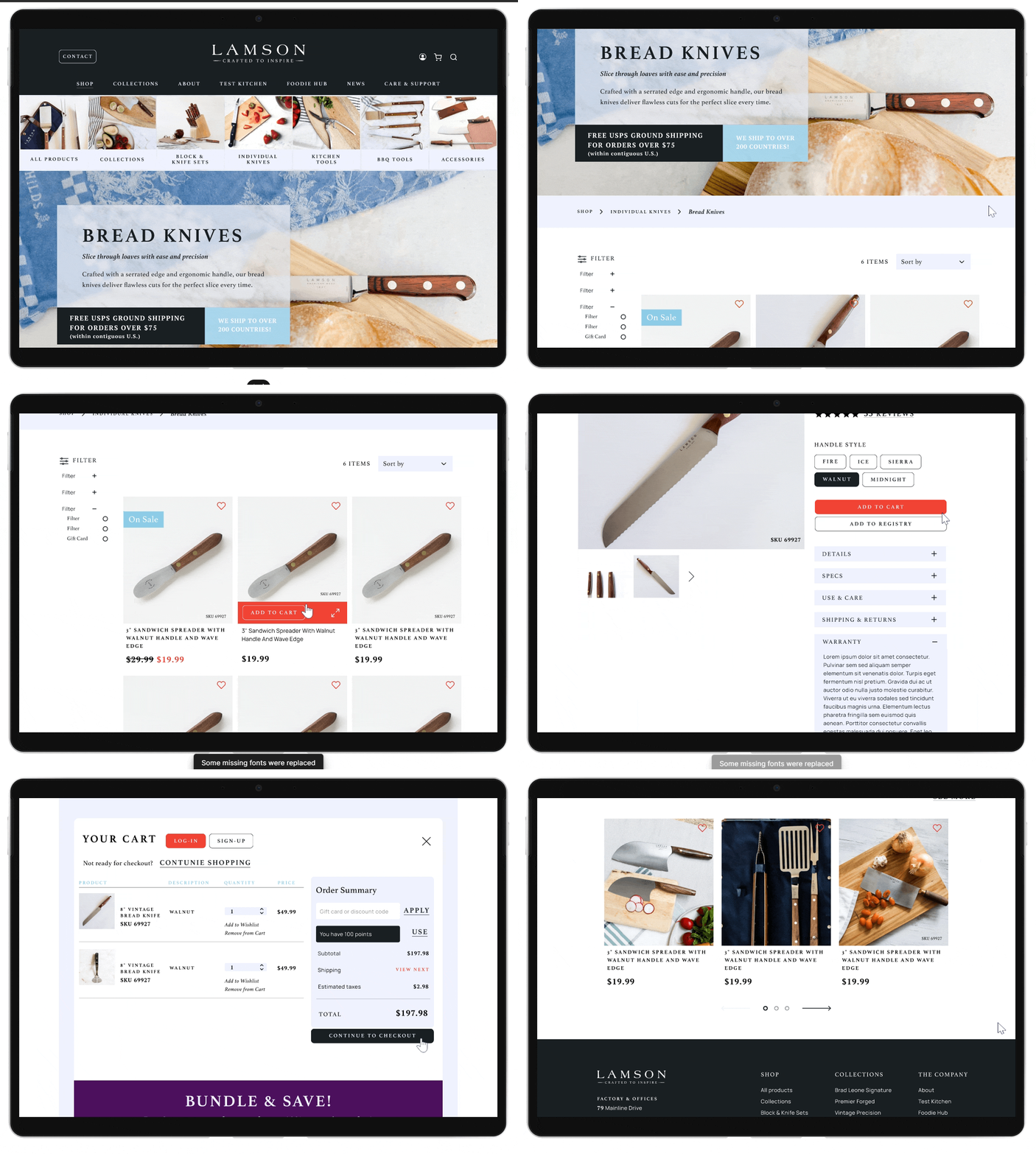
Easy Shopping Experience: Developed user-friendly navigation, detailed product pages, and clear call-to-actions to streamline the shopping process.
Increased Engagement: Added interactive elements like infographics, micro-interactions, and community features for users to share recipes, stories, and photos, strengthening connection and brand loyalty.
These solutions collectively boosted Lamson’s brand awareness, improved the shopping experience, and enhanced user engagement, leading to increased sales and a stronger online presence in the culinary market.
My Responsibility
In my role designing Lamson website, I was responsible for:
Information Architecture: Structuring content for intuitive access to insurance services.
Wireframing: Developing page blueprints to ensure a user-friendly layout.
Design: Working with the senior graphic designer to align visuals with brand guidelines.
Prototyping: Building interactive prototypes to deliver an engaging user experience.
Information Architecture
The site map is organized into two main sections:
Shopping Section: Focuses on providing a seamless shopping experience with pages like Product Catalog, Product Details, Shopping Cart, and Checkout to guide users through exploring and purchasing Lamson’s products.
Tips and Info Section: Offers valuable content beyond shopping, including About, Collection Stories, Foodhub (a community space for sharing recipes and stories), Care and Support (guidance on product care), Articles, News, and Contact.
This structure serves both shoppers and users interested in community engagement and product information, creating a well-rounded and user-friendly website.
Wireframing and Prototyping
Lo-Fi Wireframes: Developed the website’s layout and content placement with the UX writer, ensuring that the design guided users effectively while maintaining Lamson’s brand identity.
Hi-Fi Wireframes: The graphic designer, informed by my research and the brand book, crafted the Home page to set the website’s visual tone. Together, we designed the remaining pages to maintain brand consistency and enhance the user experience.
Prototyping: Enhanced the site with engaging elements like animations, hover effects, sliders, and interactive infographics. This created a captivating and seamless user experience, aligning functionality with aesthetics to increase user engagement on Lamson's platform.


