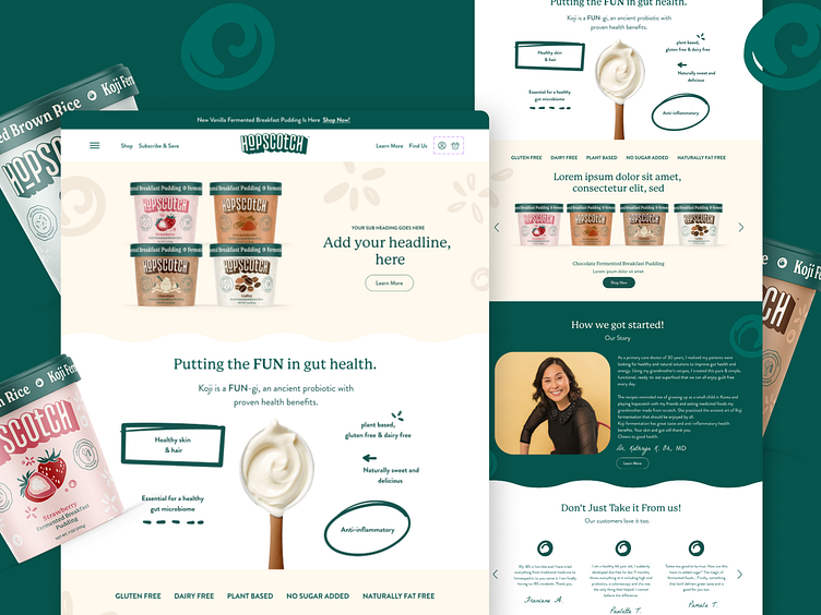
Hopscotch Web Design
Enter your text here...Hopscotch’s brand identity is a playful and whimsical take on a Korean-inspired fermented breakfast pudding, designed to capture the joy of starting your day with something both nutritious and fun. The friendly, inviting colors and playful typography give the brand a lighthearted, approachable vibe. Custom illustrations further enhance the charm, adding a unique and handcrafted feel that reflects the care and creativity behind the product. Every element of the design makes Hopscotch stand out as a fresh, fun, and friendly choice for breakfast.
Check out our other projects!
✨ Ashbi.ca ✨
More by Ashbi Design View profile
Like

