Uppora
A platform for donations to favorite authors, content creators, video channels, as well as for donations to charitable foundations and organizations. The naming plays on the combination of the cyrillic word “опора” (“support”) in the sense of “being a support to someone” and “up” as a symbol of growth and development for the author or channel.
Logo
The entire service is built on the idea of “making financial support the norm, turning helping others into a habit.” Therefore, the graphic symbol translates this main message into a visual image of a “toggle button,” which symbolizes the “activation” of the habit, shifting from one-time event to a regular mode.
In the wordmark, the dot in the letter “U” as a symbol of switching is mirrored as an additional rhyming element in the lowercase “r.” This, along with the rhythmic arrangement of the inner spaces in the letters “p,” “o,” and “a,” visually stitches the entire inscription together.
Visual Identity
The signmark becomes the main visual reference for the identity — all other components will be based on it. The structure of the letter “U” provides a non-trivial asymmetry for traditional elements such as round avatars and text background, allowing the unexpected contour to brand a profile page, news feed, or, for example, the interface of an internal chat with fans.
For example, posts in the feed are arranged in a characteristic vertical stack, formed according to a “tiles” principle, while the list of supported authors and projects transforms into a horizontal stack, visually maintaining the shape with asymmetric rounding. The same approach is applied to colored background that highlight key words in the titles.
Share You Impact
The main idea underlying the tone of communication is to convey a positive experience of helping somebody. This is achieved through the opportunity to showcase one’s involvement in supporting others in a personal profile, as well as through the chance to feel like part of a community of like-minded individuals, thereby increasing the level of happiness not only for those who needed help but also for oneself.
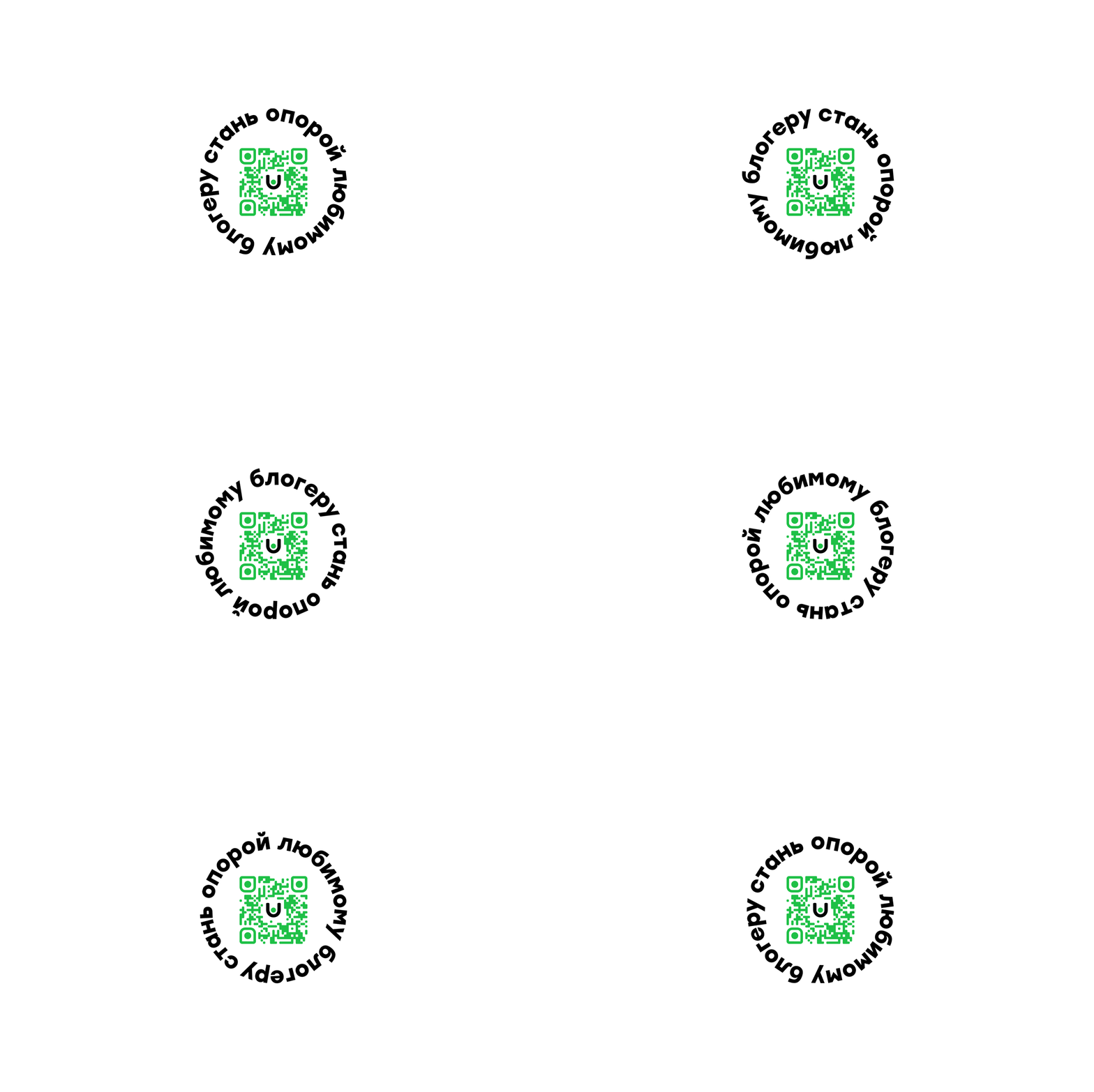
By fully extending the main visual approach to all media, the U-shaped form becomes the foundation for a design-kit, allowing for the creation of a flexible and easily reproducible modular system. Its capabilities cover any current and potential future tasks.
“I’m impressed by Aleksey’s professionalism at all stages, from the approval of the technical assignment to the final presentation. The result matched my vision and reflected the intended meanings.”
Ilya Panov, Founder Uppora


