EP Landing Page Design
Project Description
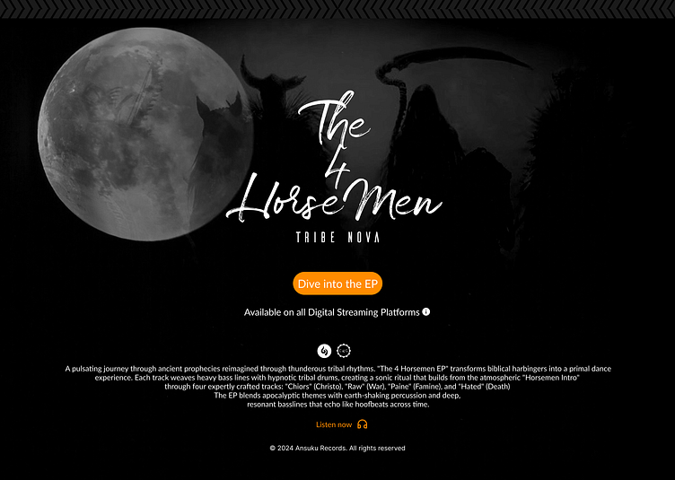
This project is a design challenge focused on creating a landing page that effectively promotes and presents a musical EP. The goal was to create an immersive, atmospheric design that balances both form and function while maintaining strong UI/UX principles. The design centers around "The 4 Horsemen" EP by Tribe Nova, featuring a dark, apocalyptic theme.
The Brief #2
Design a landing page with clear consideration for the main focus (music EP), incorporating essential landing page elements like call-to-actions and content clarity. The design should effectively communicate the product while maintaining user engagement and accessibility.
Target Platform
The design was implemented as a responsive mobile-first approach, with three different mobile viewport variations that maintain consistency while adapting to different screen sizes.
Functional Design Decisions
What problem am I trying to solve with my design?
Creating an immersive first impression of the EP's concept
Providing clear access to streaming platforms
Communicating the EP's theme and track listing effectively
Balancing atmospheric design with functional usability
How does my design address the user's needs and pain points?
Prominent "Dive into the EP" CTA button
Clear track listing with thematic naming
Visible streaming platform availability
High contrast text for readability
Visual Hierarchy and Layout:
Centered, vertical layout optimized for mobile viewing
Full moon as anchor point drawing initial attention
Title as secondary focal point
CTA button positioned for easy thumb reach
Description and track listing in clear reading order
Colour Palette, Fonts, and Visual Elements:
Monochromatic black and white scheme with orange accent
Handwritten-style font for title creating artistic appeal
Clean sans-serif for body text ensuring readability
Atmospheric imagery (moon, silhouettes) reinforcing theme
Key Interactions:
CTA button for immediate EP access
Streaming platform links
Responsive design elements
Potential for hover states and animations (to be implemented)
Technical Design Decisions
Layout:
Single-column mobile-first design
Careful spacing between elements
Strategic placement of visual elements
Visual Hierarchy:
Large title treatment
Prominent CTA button in contrasting colour
Clear separation of content sections
Atmospheric background elements
Additional Considerations
Accessibility:
Sufficient text sizing
Clear button states
Alt text implementation needed
High contrast text against dark background
Branding:
Consistent dark theme
Apocalyptic/tribal aesthetic
Custom typography for title
Cohesive visual language
Mobile Optimization:
Touch-friendly button sizing
Responsive text scaling
Optimized image loading
Thumb-zone consideration for interactions
Final Designs
The final designs include a desktop, tablet, and mobile design
Conclusion
The design successfully creates an immersive landing page that effectively promotes the EP while maintaining usability and accessibility standards. It achieves its primary goals of creating atmosphere while providing clear paths to action for users.
Feedback
Please feel free to add any feedback, critique, or opinions on the design that I can use going forward. 😁


