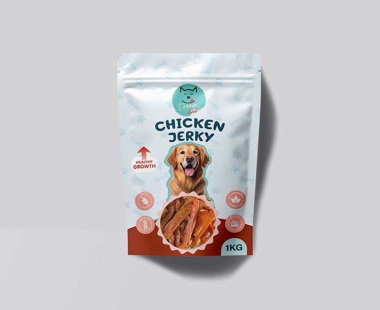
CHICKEN JERKY - DOG TREAT STANDUP PACKAGING POUCH DESIGN
In the world of pet food packaging, first impressions are everything, and my latest design for this Chicken Jerky pack exemplifies a balance of playfulness, trust, and product transparency. Every element in this package was carefully thought out, from the colors to the icons, with the intent to resonate with both pet owners and their furry companions. Let me take you through the creative journey:
Engaging Visuals: The Golden Retriever featured prominently on the front immediately builds an emotional connection, symbolizing trust, health, and loyalty—qualities pet owners deeply appreciate. This friendly face serves as the gateway to convey the brand’s promise of healthy, premium treats.
Vibrant Colors and Elements: A light sky-blue backdrop, adorned with paw prints and subtle bone patterns, creates an inviting, pet-friendly atmosphere. The soothing tones suggest purity and freshness, while the paw prints echo the brand's commitment to pet health and happiness.
Health-First Message: The packaging includes a bright red upward arrow with the message "Healthy Growth," which stands out and communicates that the product is not just a snack, but a beneficial addition to a pet's diet. This small but powerful graphic reinforces the nutritional advantages of the jerky.
Clear Product Showcase: I've used a circular cut-out to display the actual product inside. This transparent window builds consumer trust by allowing them to see the high-quality chicken jerky inside, making the purchase decision easier and more confident.
Functional Icons: On the lower left, clear, crisp icons emphasize the core product benefits: gluten-free, high protein, and grain-free. Each icon was designed with simplicity and clarity, ensuring that even at a glance, the health benefits are unmistakable.
Balanced Typography: The bold, friendly font for "Chicken Jerky" was chosen to reflect both playfulness and reliability, while the brand name, "Davvies Pet," at the top, subtly incorporates a pet paw and face design, further enhancing brand identity. The clean and consistent typography across the packaging ensures easy readability while maintaining a professional appearance.
My Design Philosophy: For me, packaging design is about more than just aesthetics—it's about storytelling. I dive deep into the brand’s essence, the product’s benefits, and how it will impact the consumer. This jerky packaging wasn’t just about creating something pretty, but about crafting an experience for the customer, where every aspect adds to the brand's story of care, health, and quality. It’s about connecting with the pet lover's emotions while ensuring that the product stands out on the shelves.
Let’s bring your brand story to life through impactful packaging!

