Fuego Corazón
Branding and packaging design for a mezcal brand
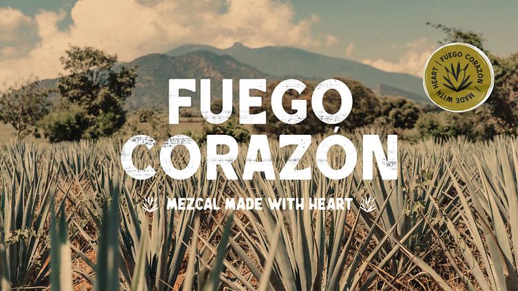
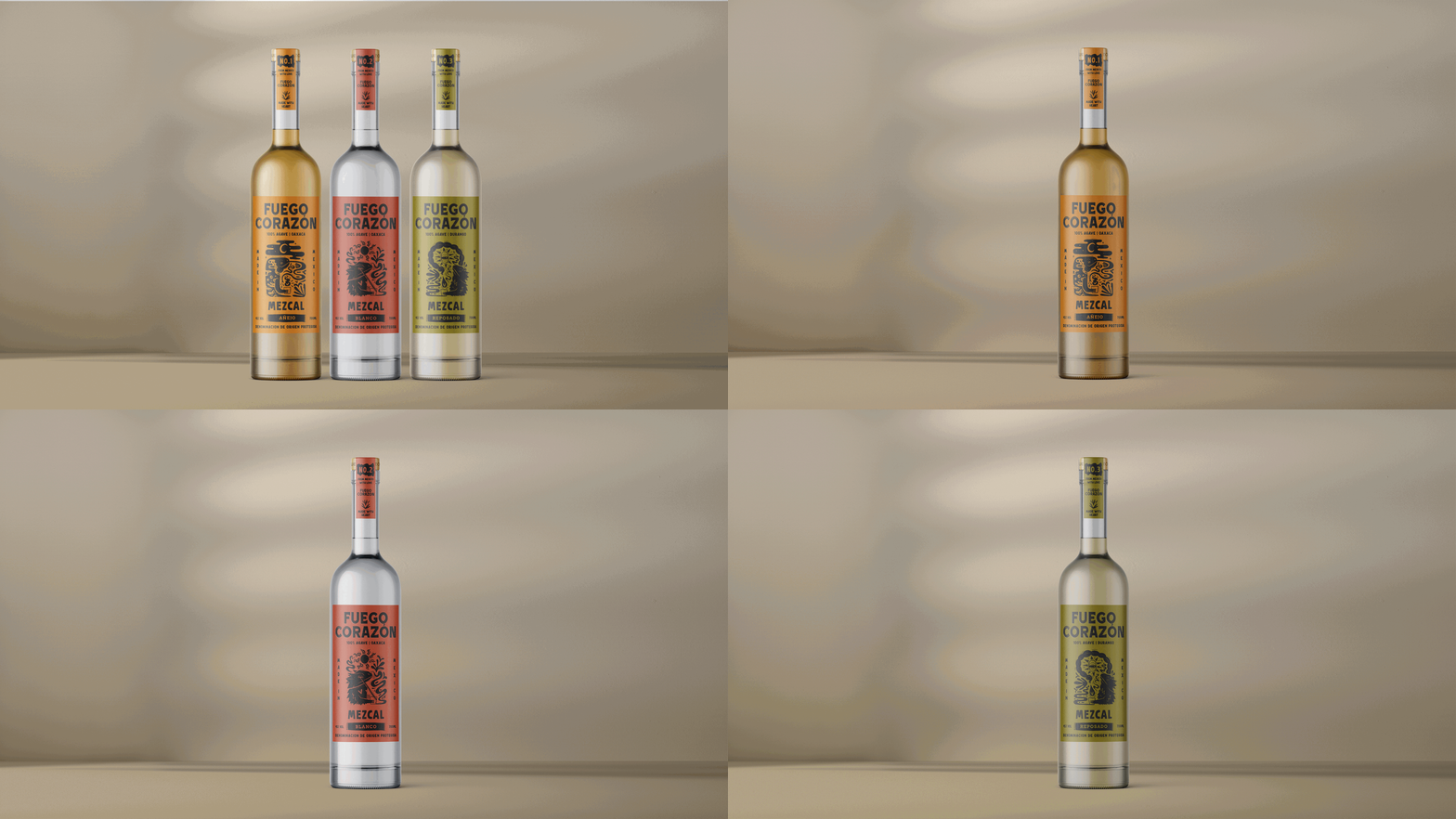
This is a brand identity collaboration between graphic designer Studio Fen and illustrator K Page, combining our skills and passion for design. Our goal was to create a brand that celebrates each aspect of the project, from the rustic typography and bold illustrations to the intense flavours of mezcal, the hostile wildlife of the Mexican desert, and the playful tone of voice.
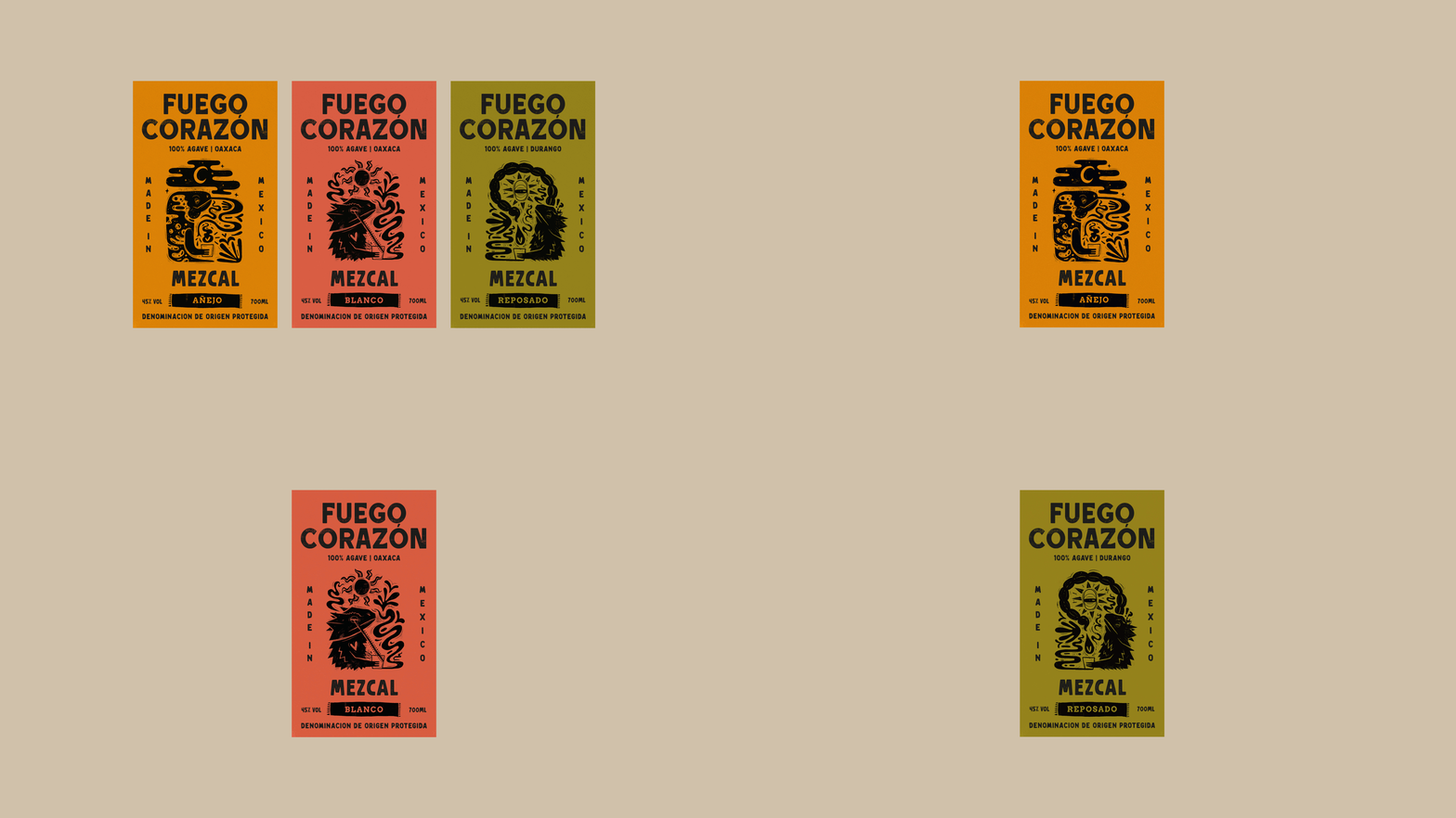
Fuego Corazón, translating to Heart Fire, runs through the core of the brand’s identity, originating from the burning of the heart of the agave, which gives mezcal its distinctive smoky character. The choice of single-colour printing blurs the lines between typography and illustration, making them feel as one, each elevating the other in collaboration. The label design combines traditional printmaking techniques with modern design sensibilities, appealing to both traditional mezcal enthusiasts and design-conscious audiences
Collaboration design with K Page Illustration


