LUNA® - Brand Identity & Packaging
LUNA
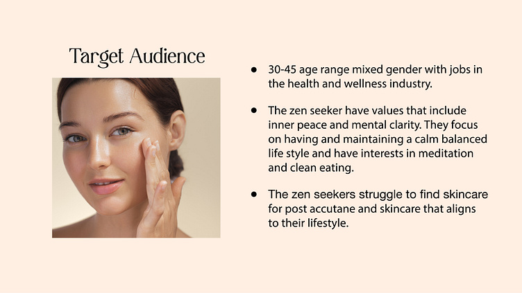
Luna skincare specializes in crafting solutions tailored to the unique needs of sensitive skin. Dedicated to providing gentle yet effective skincare products, the brand aims to soothe irritation and reveal the skin's natural radiance. With a commitment to care and balance, Luna invites individuals to embrace their sensitivity and uncover their best selves.
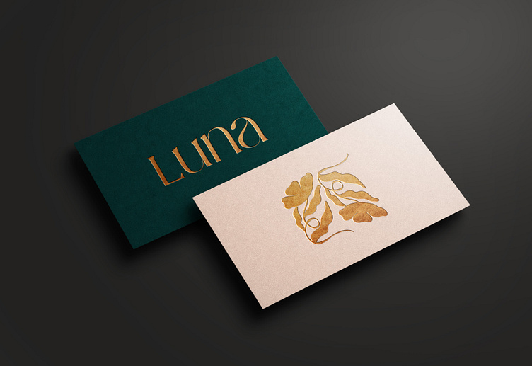
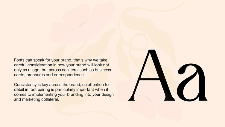
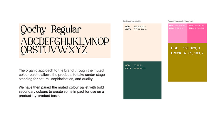
We created a modern, typographic logo design for Luna, as well as full branding: a typographic system and clean light color palette. Symbolizing beauty and energy, the vibrant color evokes a sense of radiance and rejuvenation, aligning with the brand's mission to reveal the natural beauty of sensitive skin.
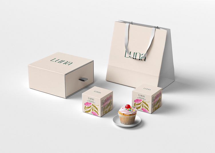
The labels and cosmetic boxes are clean and simple, showcasing the brand's dedication to purity. Each box has a subtle touch of luxury with the word "Luna" highlighted, making it instantly recognizable. For the unboxing experience, We made sure every detail, from the paper bags to the social media posts, reflects the brand's commitment to making you feel pampered and cared for.
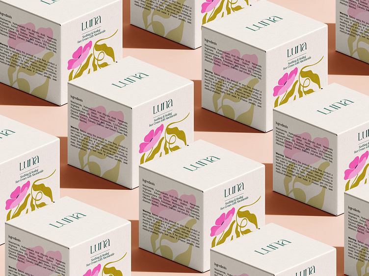
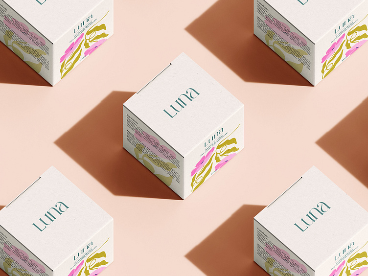
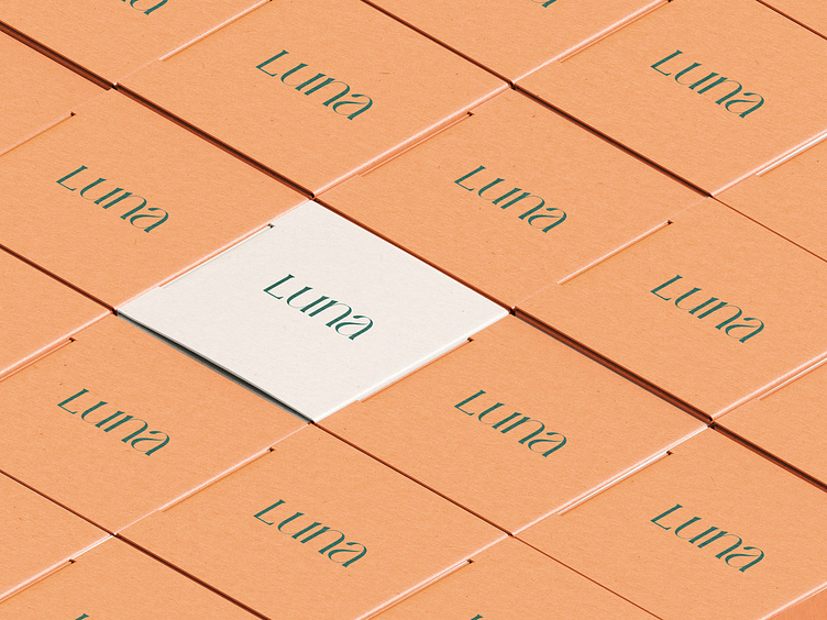
Primary and Secondary Packaging
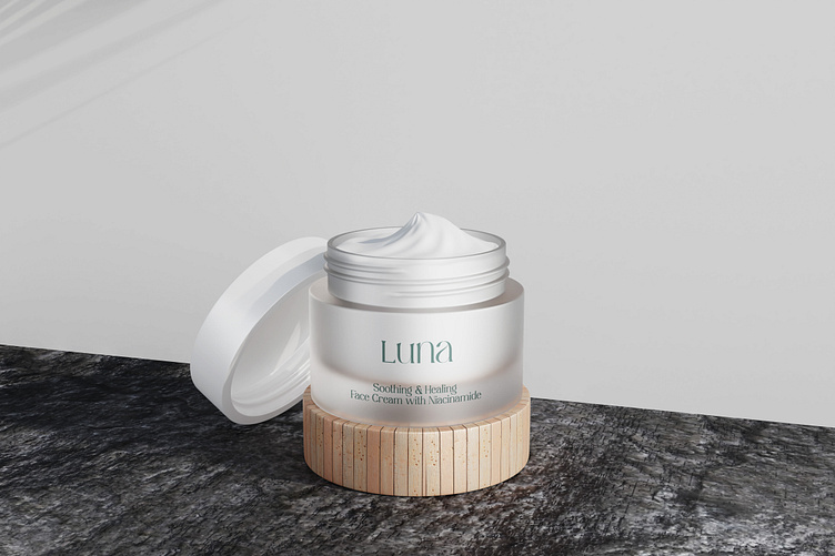
Our focus was on designing the packaging for the initial product lineup, including the cream.
While the efficacy of the formulas remains a focal point, the pink/nude hue of the packaging has emerged as the brand’s defining color. This choice adds a lifestyle flair, offering a warmer alternative to pure white. Strange Luxury aims to leverage a narrative, lifestyle-oriented artistic direction that resonates with a youthful audience. The formulas themselves embody a clean, sophisticated standard, while accents of red introduce an element of boldness and elegance.
Branding