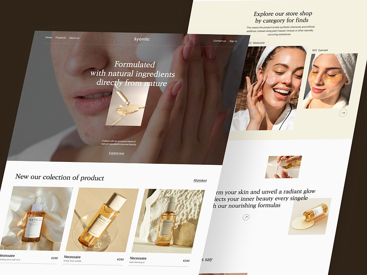
Syantic - Cosmetics Landing Page
Project Overview
Syantic is a modern e-commerce platform designed to showcase and sell premium skincare products. The design prioritizes an elegant and natural aesthetic, reflecting the brand’s focus on high-quality, nature-based ingredients. This case study will explore the design elements, UX strategy, and overall visual language used to build a compelling and effective online shopping experience.
Objective
The primary goal of the website is to promote the skincare product line and enhance customer trust through:
A clean and minimal aesthetic that aligns with natural skincare branding.
A smooth shopping experience with well-organized product sections.
Reinforcing trust through testimonials and lifestyle imagery.
Encouraging exploration with subtle CTAs and engaging layouts.
UX Highlights
Minimalist Navigation: A limited number of navigation links keeps users focused and reduces friction.
Consistent Visual Language: Natural tones, clean typography, and subtle CTAs ensure a smooth, luxurious shopping experience.
Emphasis on Imagery: Lifestyle photos and product visuals convey the brand’s message visually, minimizing the need for heavy text.
Wireframe
Conclusion
Syantic's website design reflects a deep understanding of its audience and brand values. The layout is both functional and visually appealing, encouraging exploration while reinforcing trust through consistent messaging and natural aesthetics. The focus on simplicity ensures a seamless user experience, making it easy for potential customers to engage with the brand and explore the product offerings.
With a few minor adjustments, this website has the potential to become an even more powerful tool for customer engagement and sales conversion.


