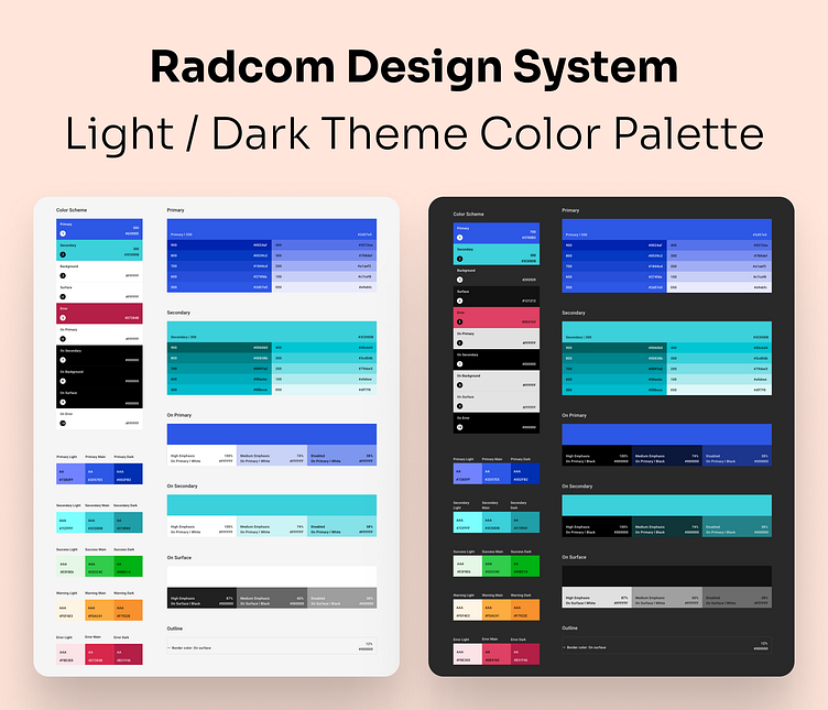
Radcom Design System Light/Dark Theme Color Palette
Radcom Light/Dark Color Palette
This color palette includes primary, secondary, neutral, success, warning, and error colors for both light and dark themes. The number of "A"s assigned to each color indicates the supported level of accessibility.
🛠️ Tools Used: XD
🚀 Key Features: Light/Dark Palette
Feedback is welcome! Let me know what you think about the color palette. 🙌
Feel free to use it if you like it. 😃
Date: July 2021
Have a project in your mind?
If you would like to work with me, email some details about your product/project.
More by Hussein Shirvani View profile
Like
