Märzen - Beer Label Packaging Design
Beer For Here
Welcome to the "Beer For Here" series. Enjoying a beer is not just about the taste; it's deeply influenced by the surroundings in which you drink it. Inspired by this idea, I've embarked on creating a series of beer labels that encapsulate the essence of various locations and aesthetics—melding the distinctive vibe of each place with the rich history of different beer types. This project aims to transform each sip into a more immersive experience, where the beer and its label are in perfect harmony.
About the Märzen Style
Märzen is a traditional Bavarian lager brewed in March and stored for fall festivals like Oktoberfest. It’s characterized by its amber hue, rich maltiness, and a balanced, smooth finish with mild hop bitterness. Typically medium-bodied, Märzen offers toasty, caramel-like flavors, making it a perfect autumn beer.
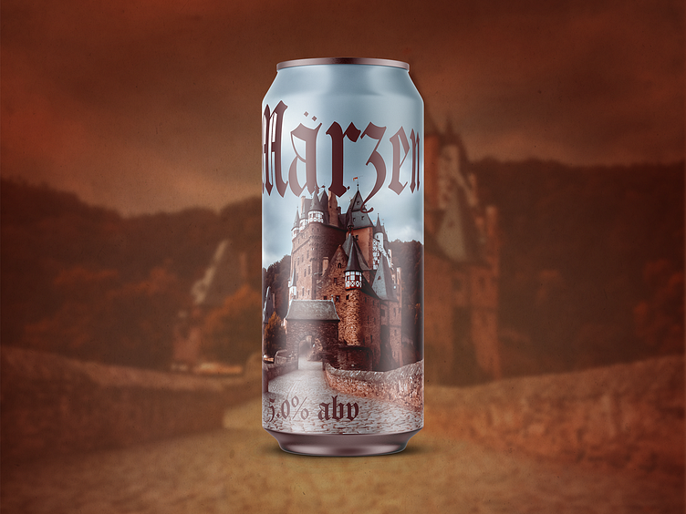
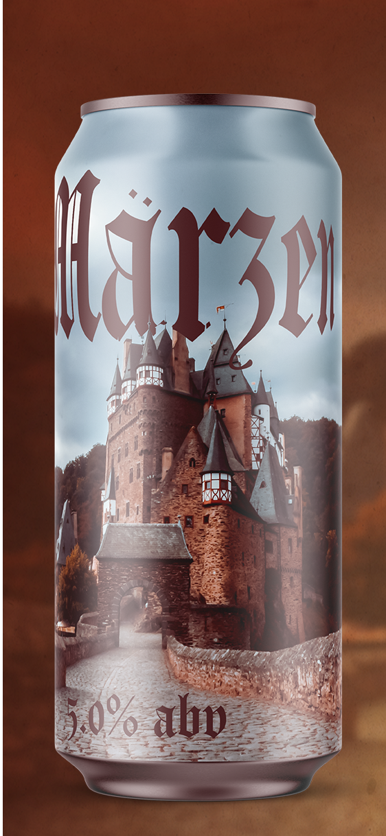
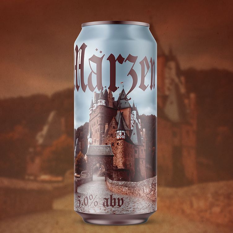
About the Design
This Märzen beer label combines a medieval aesthetic with a strong sense of place and time. The background prominently features a stunning medieval castle, setting a historical tone that evokes the origins of the Märzen style. The blackletter typography in bold, dark lettering reinforces this traditional feel, recalling ancient script and Gothic architecture. The earthy, autumnal color palette, with deep browns and warm oranges, complements the style’s fall festival roots, creating an inviting and rustic design that pairs perfectly with the rich, malt-forward character of the Märzen beer.

About Me
I run a design and branding studio focused on helping craft producers, startups, and small businesses thrive. With over 350 labels designed and collaborations with boutique brands worldwide, I offer full-service branding, web development, packaging, and graphic design. Visit pinewatt.com to see my work and connect—let’s bring your next creative project to life.