Design for Accessibility:
Headings for Screen Readers 1/2
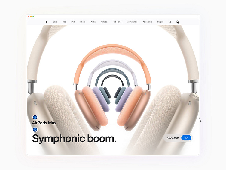
Apple demonstrates how headings are structured based on their role in content hierarchy, rather than their appearance.
H1 for the product name, AirPods Max.
H2 for the tagline, Symphonic boom.
This ensures that screen readers can logically interpret the hierarchy, even if visually the styles may differ.
Key Tip: Always assign heading levels based on semantic importance. Avoid choosing heading tags based on font size or appearance alone.
