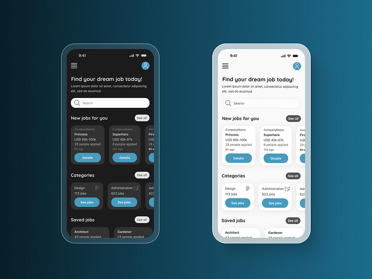
Dark and light Search screen
Daily UI #022 - Search
I focused on structure, hierarchy and filtering for this Search screen. For the first time during my DailyUI Challenge journey instead of designing only one version, I went for dark and light mode. 🌗
More by Ági Rigó View profile
Like
