Ditto Brand Refresh
Ditto provides resilient peer-to-peer and cloud-optional data synchronization for mobile, web, IoT, and server applications. Their platform enables real-time syncing across devices, even without internet connectivity. With a developer-friendly SDK, Ditto supports cross-platform APIs that facilitate seamless data transfer, offline capabilities, and automatic conflict resolution. It's used in industries like aviation, retail, and defense to ensure data remains synchronized and accessible, regardless of network availability.
Pivot at Identity
"Why"s behind the refresh
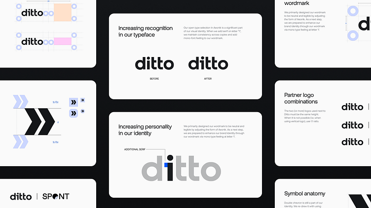
The initial identity approach was inspired by the pain of disconnection, centering the visual identity around a dark theme that evoked empathy for this discomfort. This theme remained in use for over a year. As the company grew, the focus shifted from "What is Ditto?" to "How Ditto can help." With increased brand recognition, a lighter, more communicative, and marketing-oriented approach was needed to align with new business priorities.
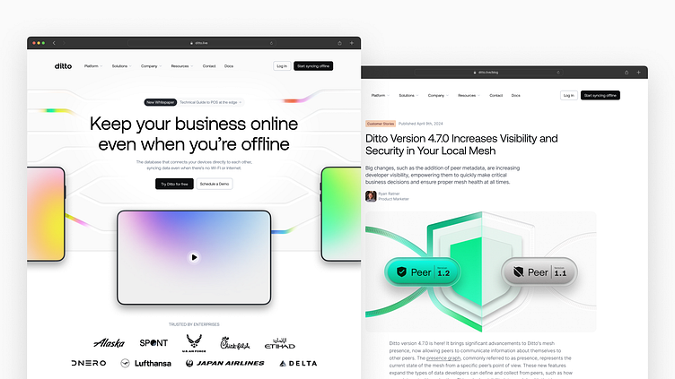
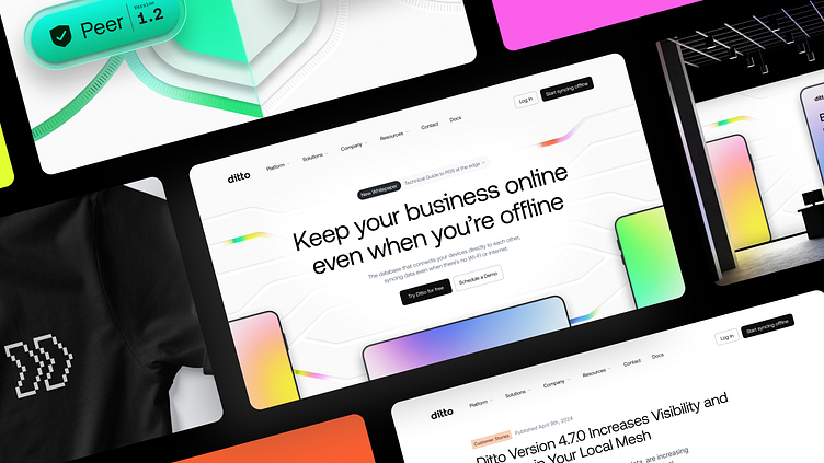
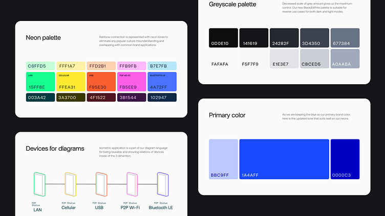
The identity pivot reflects both online and offline scenarios, highlighting Ditto’s ability to provide resilient connections for enterprise applications. To embody this, the visual identity evolved into a dark-and-light theme, supporting both marketing and brand-focused approaches. Neon colors were chosen to evoke a digital feel and represent the different types of connections Ditto ensures, reinforcing the brand's core value of resilience.
As a developer-first tool, diagrams played a crucial role in Ditto's identity development, though they were initially challenging to formalize. There were three key questions that potential partners frequently asked during presentations, so the goal was to simplify and visually represent solutions, allowing the audience to focus on the technology.
1 - How far Ditto can sync?
Isometric artboards were used to illustrate dimension.
2 - Which devices are compatible?
Visuals showed that Ditto works on any device, regardless of model or OS.
3 - Online vs. Offline status representations
Complex visuals caused clutter, so we assigned "states" to devices, like a protective case representing continuous presence. This helped streamline the visuals, allowing the audience to focus on key changes without distraction.
Thanks for watching!
