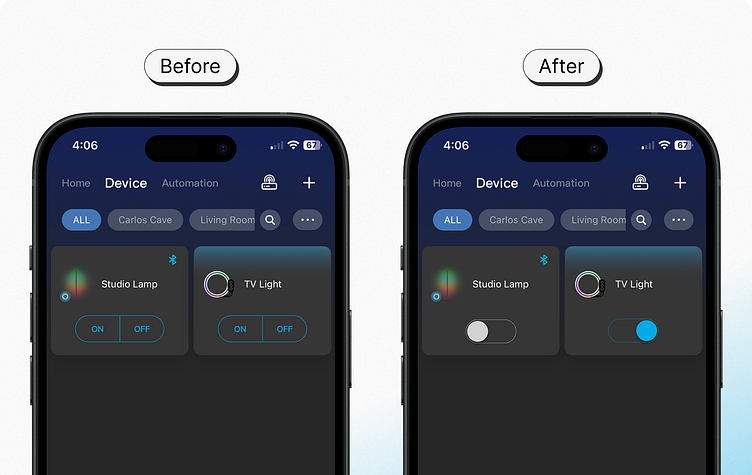
A Little UI Change, Big Usability Impact
I own a couple of Govee Smart Lights at home. The UI on the left is what the app looks like right now. Every time I open the app to turn the lights on or off, it takes me some time to figure out whether the light is 1) on or off, and 2) whether I pressed the right button for the desired action. In short, I don't believe the experience is intuitive.
So, what if...
A small tweak to the UI that can bring significant gains in usability is changing the "on/off" buttons to toggles.
This change helps in two main ways: First, upon page load, users can immediately recognize the state (on/off) of each Smart Light. Second, upon changing that state, the visual change from the toggles works as confirmation that the action took place.
This is a great example that illustrates why I think a toggle for boolean operations works better each time.
💡
