DailyUI #024 Boarding Pass
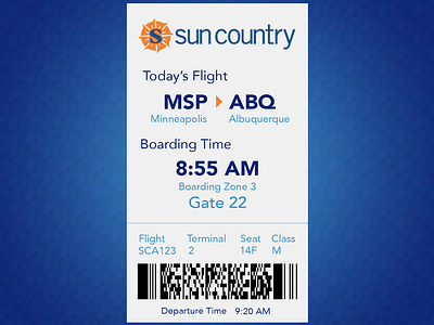
Sun Country Airlines doesn't have a great looking app, but if I could redesign it, I'd try to align their mobile boarding pass with what a customer is typically looking for.
These are colors chosen from within the existing color scheme.
At this point in the process, I'm assuming the customer is already at the airport and checked in, so they really need to know the boarding time and the gate.
Other information is ancillary at this point in the process.
More by Leitha View profile
Like
