Visual Identity - Cater&co.
Cater&co. redefines the modern cafe experience by blending premium coffee culture with a commitment to fostering genuine connections. In a world where cafes often prioritize either quality or comfort, Cater&co. stands as a testament to the belief that the two aren't mutually exclusive.
Logomark
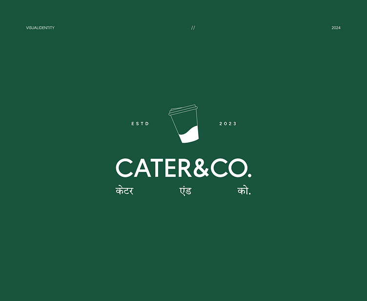
The Cater&co. wordmark serves as the primary logo, with the coffee cup acting as a distinctive visual element that symbolizes the connection between quality and community. The logo has been crafted to be both timeless and versatile, working seamlessly across various applications while maintaining its impact.
From the carefully sourced beans to the thoughtfully designed spaces, every aspect of Cater&co. is crafted to elevate the everyday coffee experience while nurturing meaningful connections.
The Palette
The color palette of Cater&co. has been meticulously crafted to reflect the brand's essence:
Deep Coffee Brown: Representing quality, richness, and the heart of our offering
Warm Cream: Evoking comfort, warmth, and the welcoming atmosphere
Muted Teal: Adding a contemporary accent that sets us apart
Earthy Green: Grounding the palette and adding depth
Typography
The typography system embodies the balance between sophistication and approachability.
The Primary Font is Okine Sans Clean, modern, and highly legible for body text and digital applications.


