Cart Icon Design A/B Test ✦ Princess Polly
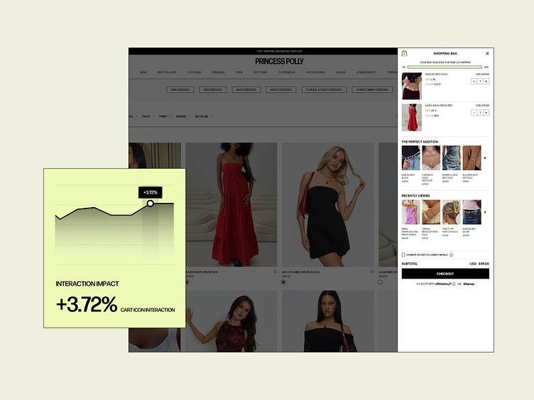
In this CRO test, we hypothesized that changing the color of the cart/bag icon—both in the navigation and when users add a product to their cart—would significantly improve visibility and engagement. By using bold, eye-catching color changes paired with real-time number updates in the cart drawer, we aimed to draw more attention to the cart during the shopping experience.
The result? A 3.72% increase in cart icon interaction, simply by enhancing the visual prominence of the cart icon.
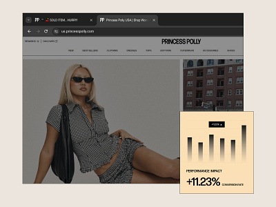
This test underscores the impact of small design tweaks in driving higher user engagement and, ultimately, revenue growth.
About Prismfly
Driving revenue for eCommerce brands through conversion rate optimization, full-stack development, branding, UI/UX design, and lifecycle marketing services.
learn more at www.prismfly.com
or reach us directly at [email protected]

