Streamlining Loan Approval which led 25% Increase in Completion
Streamlining the Soft Approval Process for Bikewale Finance Platform.
Objectives:
1. Simplify the soft approval process by reducing the number of forms from 3 to 1.
2. Align the form with current banking requirements.
3. Reduce user frustration and dropout rates.
4. Increase form conversion rates.
5. Improve user experience on both mobile and desktop platforms.
The current soft approval process for BikeWale Finance requires users to fill out 3 separate forms, resulting in a high dropout rate of approximately 80%.
Problems Identified
1. High Dropout Rate: 80% of users abandon the process.Out of 100,000 users entering the finance nudge, only 24,000 complete the soft approval form, indicating an 80% dropout rate.
2. Complex Multi-Step Form: Three separate forms to complete.
3. Outdated Structure: Not aligned with current bank requirements.
4. User Frustration: Due to multi-step process and irrelevant questions.
5. Inefficient Data Collection: Potentially gathering unnecessary information.
6. Mobile Experience: Possibly suboptimal.
7. Inconsistent User Experience: Varies based on entry point.
8. Verification Redundancy: Repeated phone verification in some cases. In some cases, users are required to verify their phone number twice (in the lead form and again in the finance form), which is an unnecessary repetition.
9. Limited Progress Visibility: Lack of clear progress indicators.
10. Revenue Loss: Due to high dropout rates and inefficient process.
11. Unclear Value Proposition: Benefits not effectively communicated upfront.
12. Data Continuity Issues: Unclear if partial data is saved for returning users.
These issues contribute to poor user experience and inefficient business processes.
Solution Overview
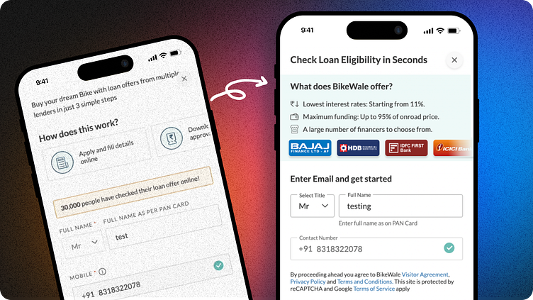
1. Field Removal:- Eliminate unnecessary fields to align with current banking requirements.- Focus on essential information collection.
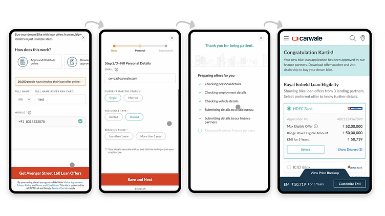
2. Single-Step Form Consolidation:- Convert the multi-step form into a single, dynamic form.- Implement a progress bar to show completion percentage.- Use progressive disclosure to reveal new sections as users complete previous ones.
3. Pre-filling and OTP Verification:- Pre-fill name and contact number for users coming from the normal lead form.- Implement OTP verification for secure user authentication.
4. Dynamic Form Sections:- Basic Details: Gender, Full Name, Contact Number, OTP- Personal Information: Email, Employment Type, etc.- Financial Details: PAN card number, work experience, etc.
5. User-Friendly Design Elements:- Clear page title and bank logos to build trust- "Why choose BikeWale" section for added credibility- Disabled CTA button until all mandatory fields are filled- Clear error messages for invalid inputs
6. Edge Case Handling:- Adapt the form for users who have already verified OTP in the lead form- Allow users to scroll up and review previous sections

UX Laws Applied in the Solution
1. 🍣 Law of Proximity: Related fields are grouped together, making the form easier to understand and navigate.
2. 🍰 Progressive Disclosure: Information is revealed gradually as users progress through the form, reducing cognitive load.
3. ☎️ Miller's Law: The form is broken down into smaller, manageable chunks to avoid overwhelming users with too much information at once.
4. 👀 Hick's Law: By reducing the number of fields and simplifying choices, decision-making time for users is decreased.
5. 🌖 Law of Prägnanz: The form layout is simplified and streamlined, making it easier for users to comprehend and complete.
6. 🤩 Aesthetic-Usability Effect: The new design is visually appealing, which can increase user perception of usability and satisfaction.
