Finance Dashboard UX Concept

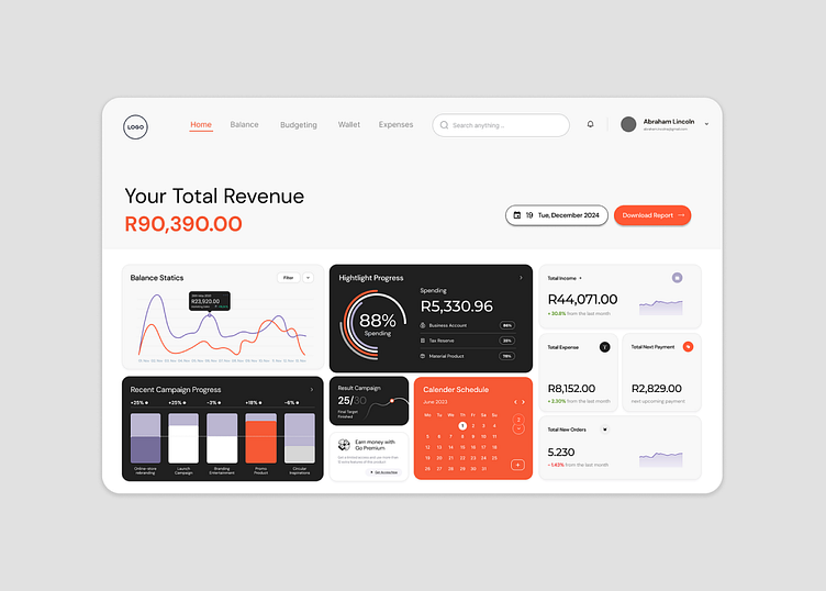
Our team undertook a strategic approach to revamp the financial dashboard, focusing on three key areas: design enhancement, user flow optimization, and feature integration. We started by simplifying the navigation, ensuring that users could effortlessly access critical financial data and tools. Dynamic visual elements were strategically incorporated to enhance the dashboard’s aesthetic appeal while maintaining optimal loading times across devices, particularly on mobile platforms. The content layout was redesigned for clarity and engagement, leveraging white space effectively to present complex financial information in a digestible format. Crucially, we ensured full responsiveness to deliver a seamless experience on all devices, catering to the mobile-centric habits of today’s financial professionals.
The redesigned financial dashboard successfully achieved its objectives, significantly improving user engagement and satisfaction. Users now spend more time interacting with the dashboard’s enhanced features and streamlined navigation. The updated design not only reflects the professionalism and expertise of our client but also sets a new standard for user-friendly financial tools in the industry.